Velt Design System & Playground
 Velt
Velt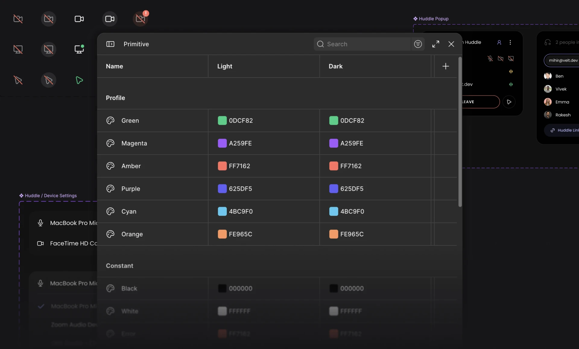
Context
Since I joined Velt, there were a lot of components that had already shipped on top of a pretty limited design system.
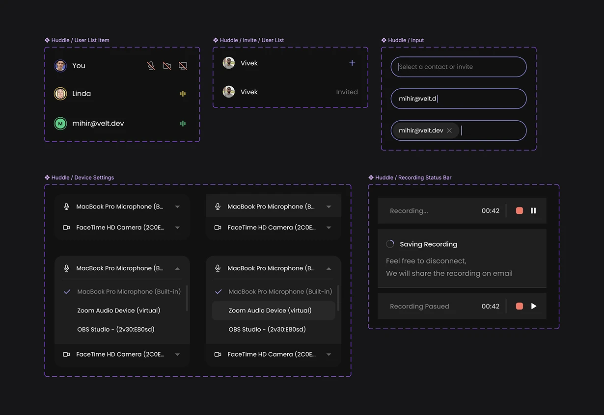
So the first step was to clean up the design system and design the new components. The biggest redesign on the table was for the huddle and recording component, so I used that as the base to build and test the new design system on.
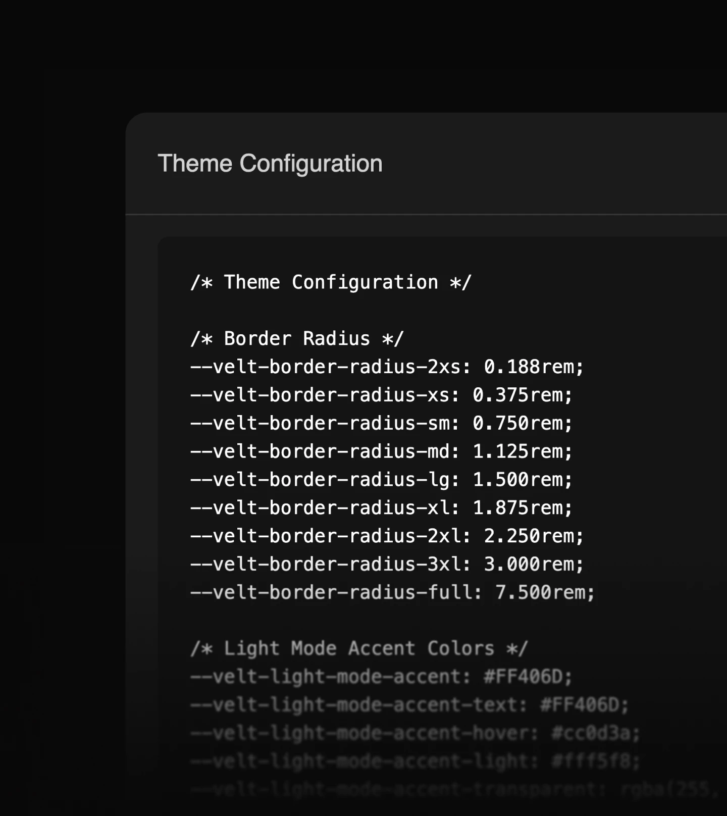
Before I joined, the design system used the old way of organising everything with styles. So I started by migrating it onto Figma's variables structure.
Surfaces
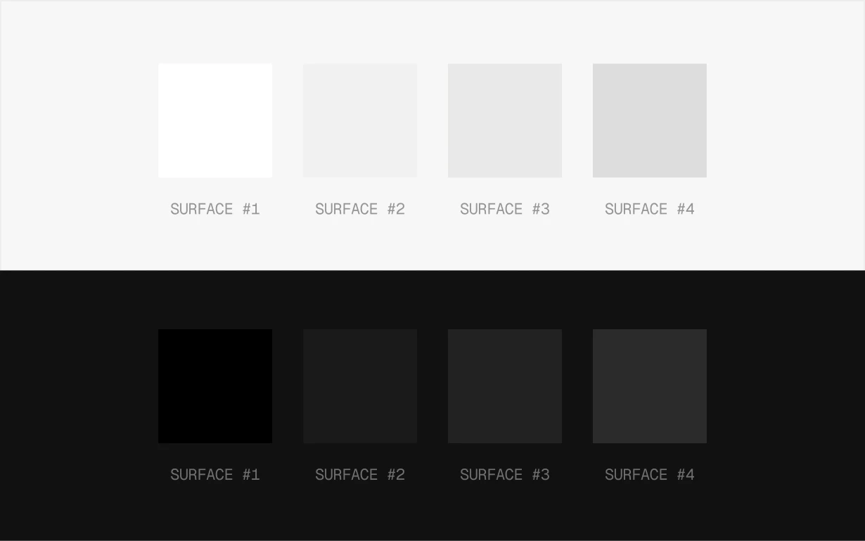
One of the issues I noticed was that the current structure only had 4 levels for surface, which was a problem when we accounted for multi-layered components along with their hover states and everything in between.
Colors
So I extended the surface colors to have 10 levels to account for all the states. Which also meant we had to extend the text styles to match these new progressions.
And then we added the rest of the colors to the system.
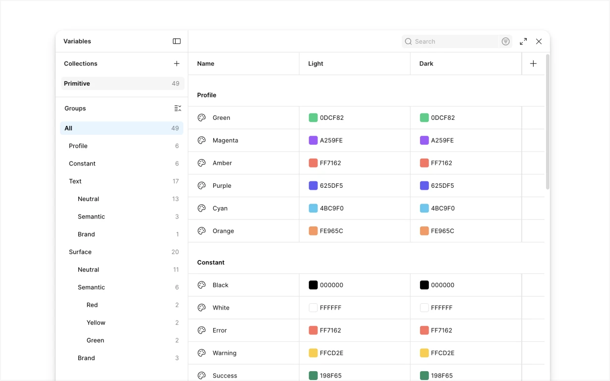
Spacing
Next on the list to fix was the spacing. We didn't have any variables or anything for it, so we set up a default scale of 4 and 2 to use on our components.
This made sure everything looked coherent and consistent across all of our features.
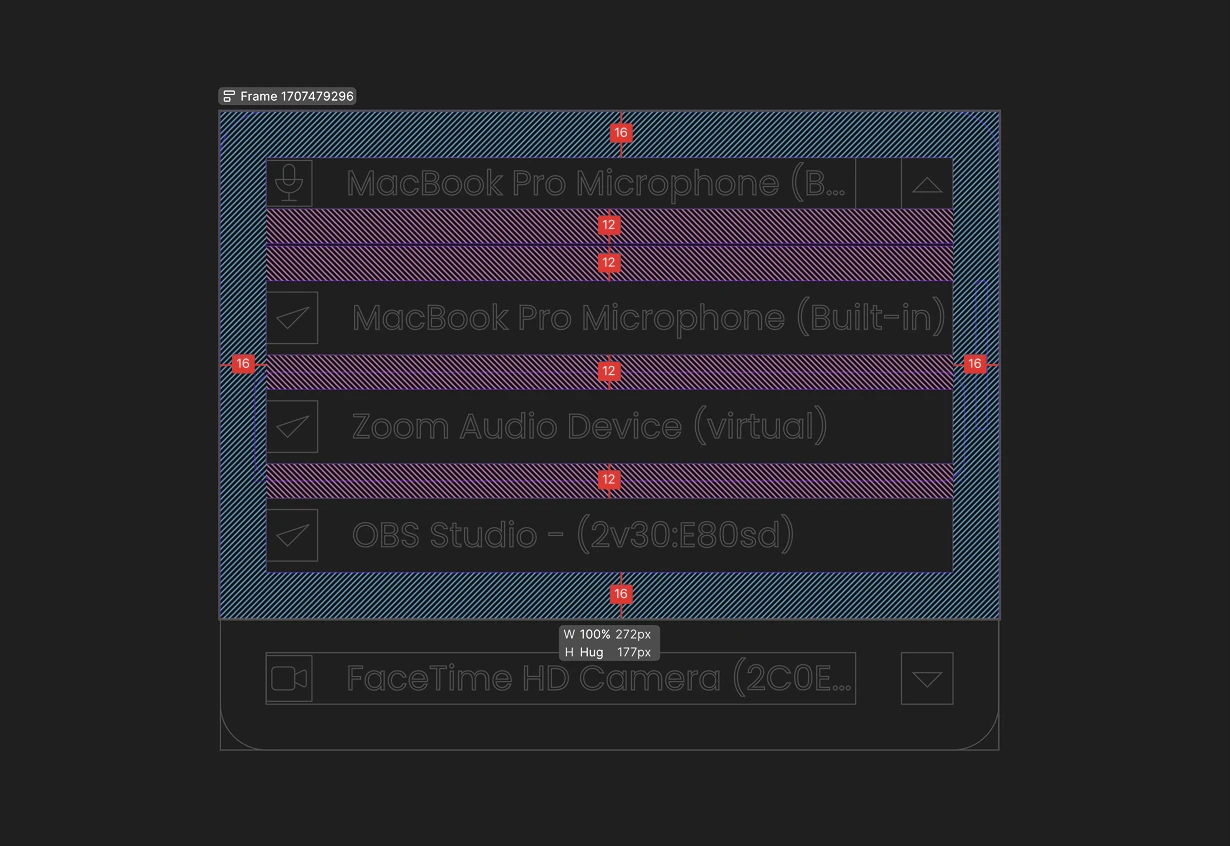
Components
Once I had all of this set, I built the rest of the components with the new variables.
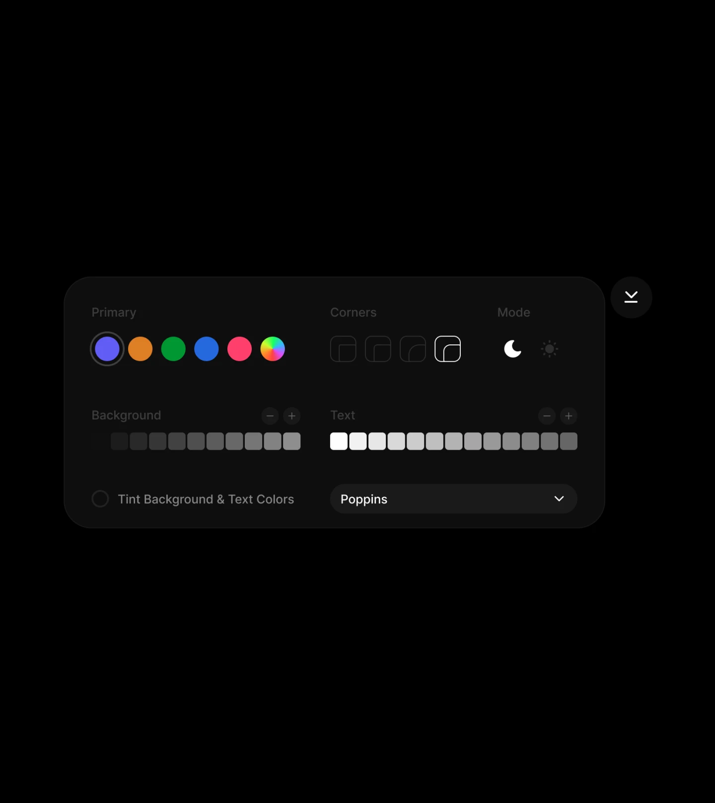
Building Playground
After having the design system in place, we made our Velt Collaboration Kit public for everyone to use. But that wasn't enough.
Our customers were still changing stuff manually in code to see what was working and what was not.
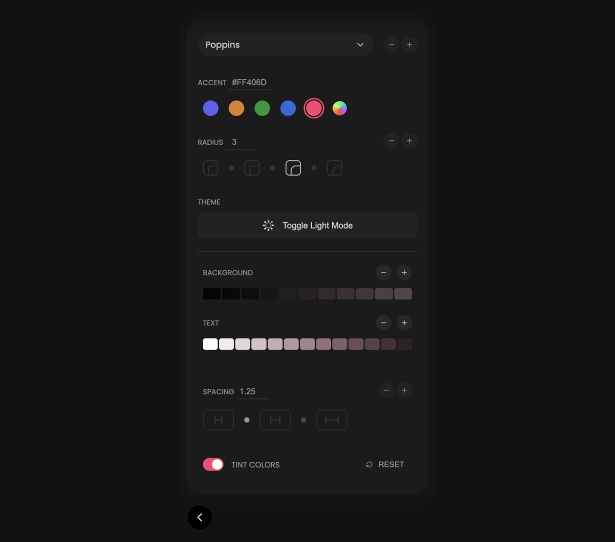
So I designed this playground where our users can change different things to see what their color, spacing, fonts and theme would look like for their implementation of Velt.
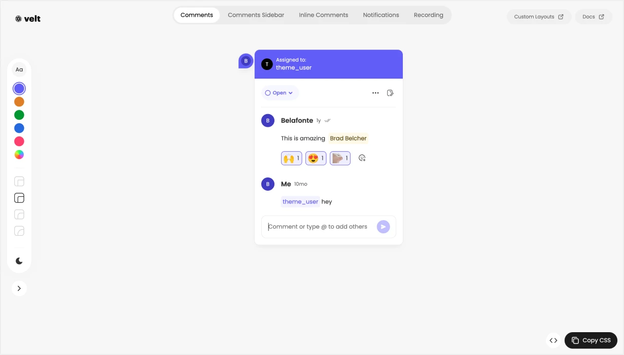
Editor Design
The playground lets users test their themes across our most popular components and copy the CSS once they are satisfied, or just read the variables that were changed to achieve their theme.
The playground was built in Angular over 3 days.