Building Superflow V2 from Scratch

What's Superflow
Superflow is a tool used by creative and marketing teams to review digital assets like websites, images, videos, PDFs and lottie files.
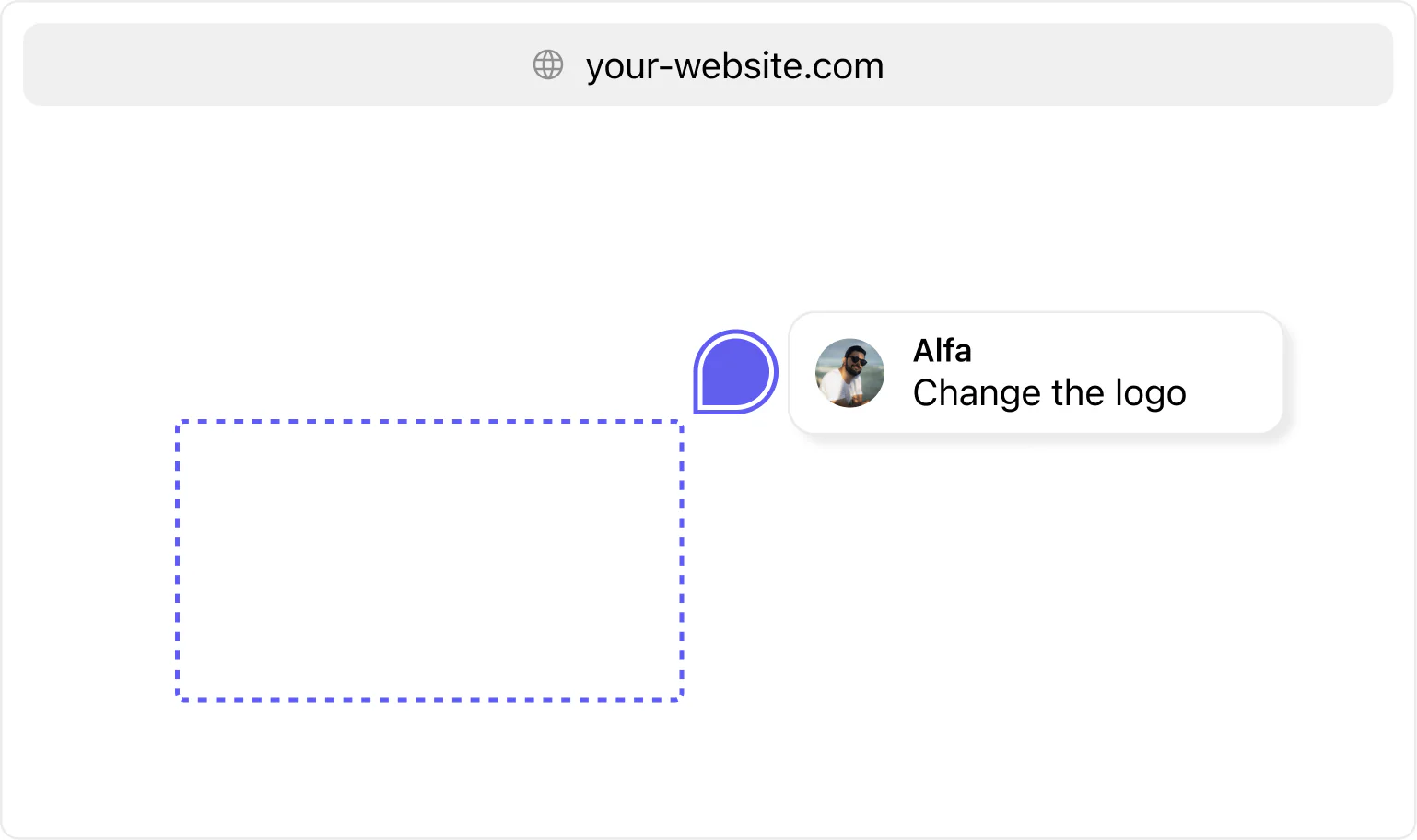
Most popular use case is website reviews, where user installs the Superflow script onto their website and they can drop figma like comments on the live website to leave feedback.
These feedback comments have inbuilt task management, notifications systems and more to make users' life easy.
Redesign
First step was to take the current UX and make the overall experience better.
We followed the standard way of redesigning - mapping user flows, benchmarking and doing some UI explorations.
We will go through three important screens in the product:
- Projects Page
- Project Detail Page
- Users Page
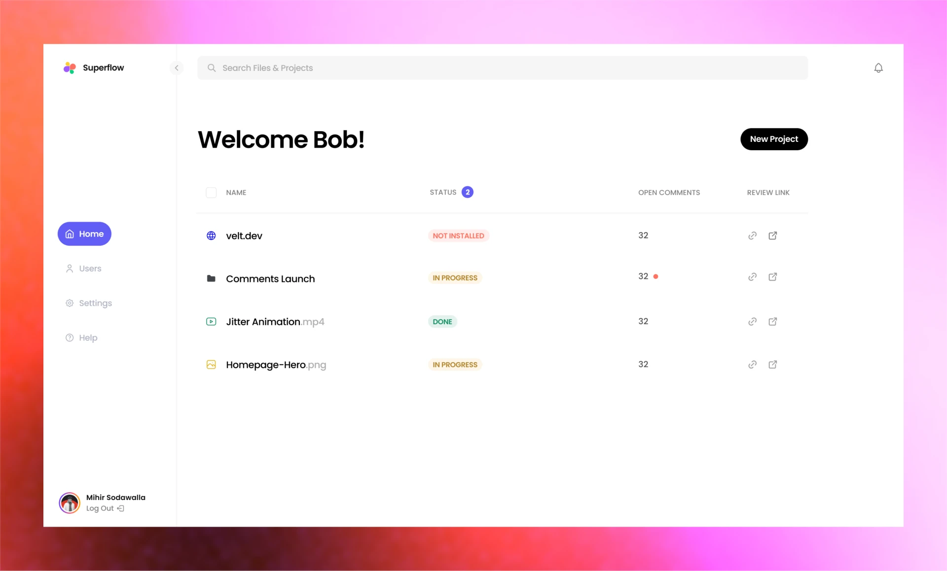
Projects Page
Starting with the projects page, the original one had a lot of things going on:
- Nav was too chunky. Something that is used few times takes a lot of real estate.
- Table gives each column same width. Name should be the first class citizen.
- Unnecessary depth using shadows.
- Pagination size of 5 is very small, which leads to multiple pages for users to switch.
- Inconsistent font sizes.
- Two separate tabs for websites and files, they should just be projects.
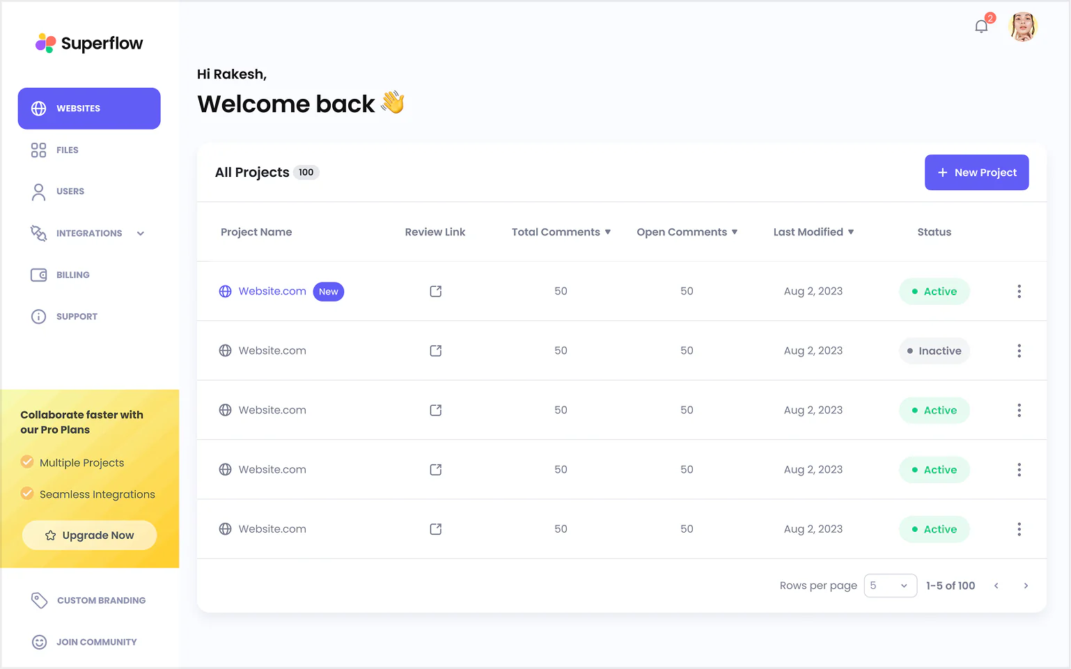
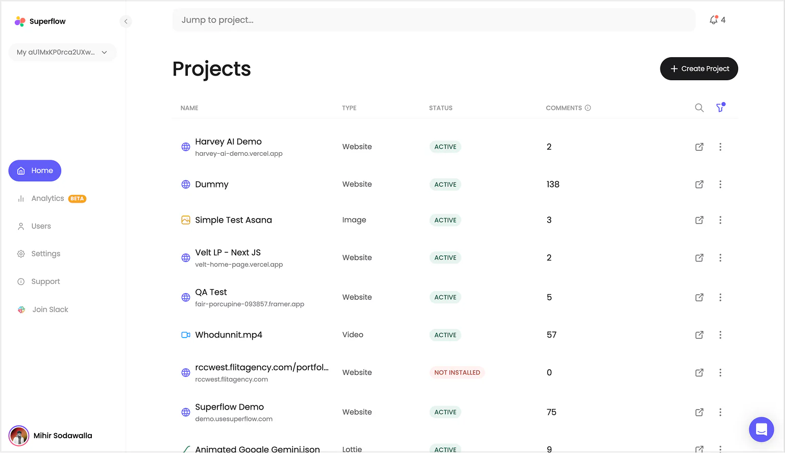
I also added some quality of life features like:
- Workspace switcher
- Global search
- Notification
- Ability to minimize sidebar
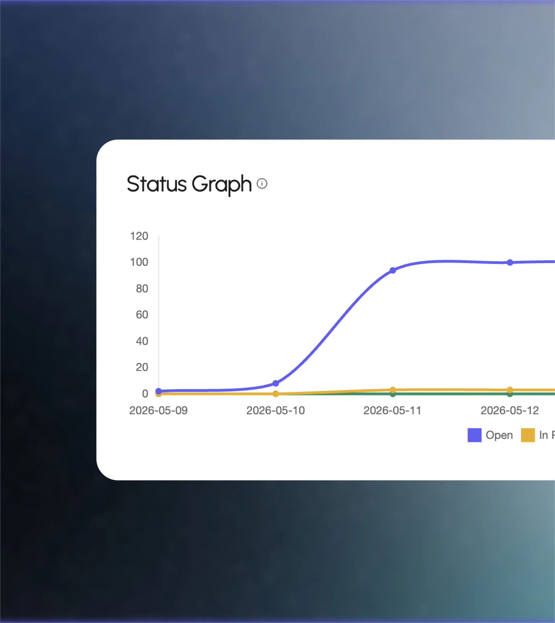
Project Details Page
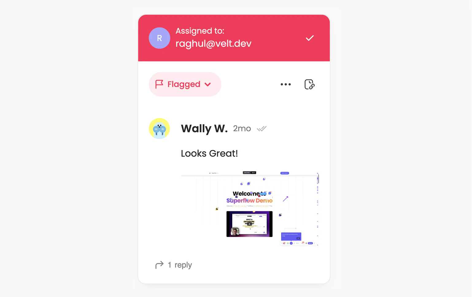
This is the page where users spent the most amount of time within the portal. Discussing feedback, assigning tasks and resolving issues.
This is a pretty thought-through screen but the UI needs to be polished a bit:
- Huge project header is taking up a lot of space.
- Page is constrained to just human comments.
- No containers for kanban board lists.
- Filters are visually disconnected from the kanban board.
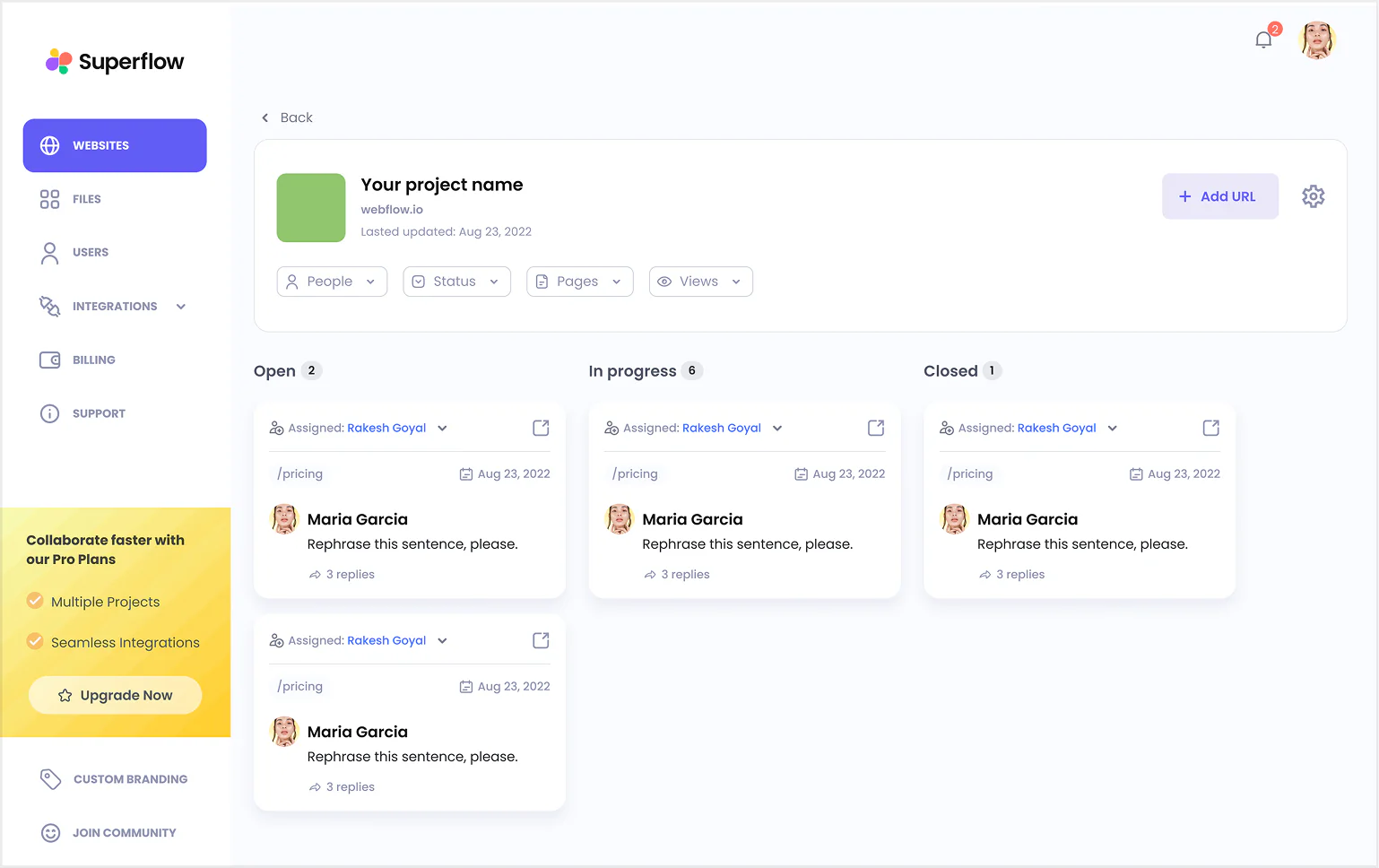
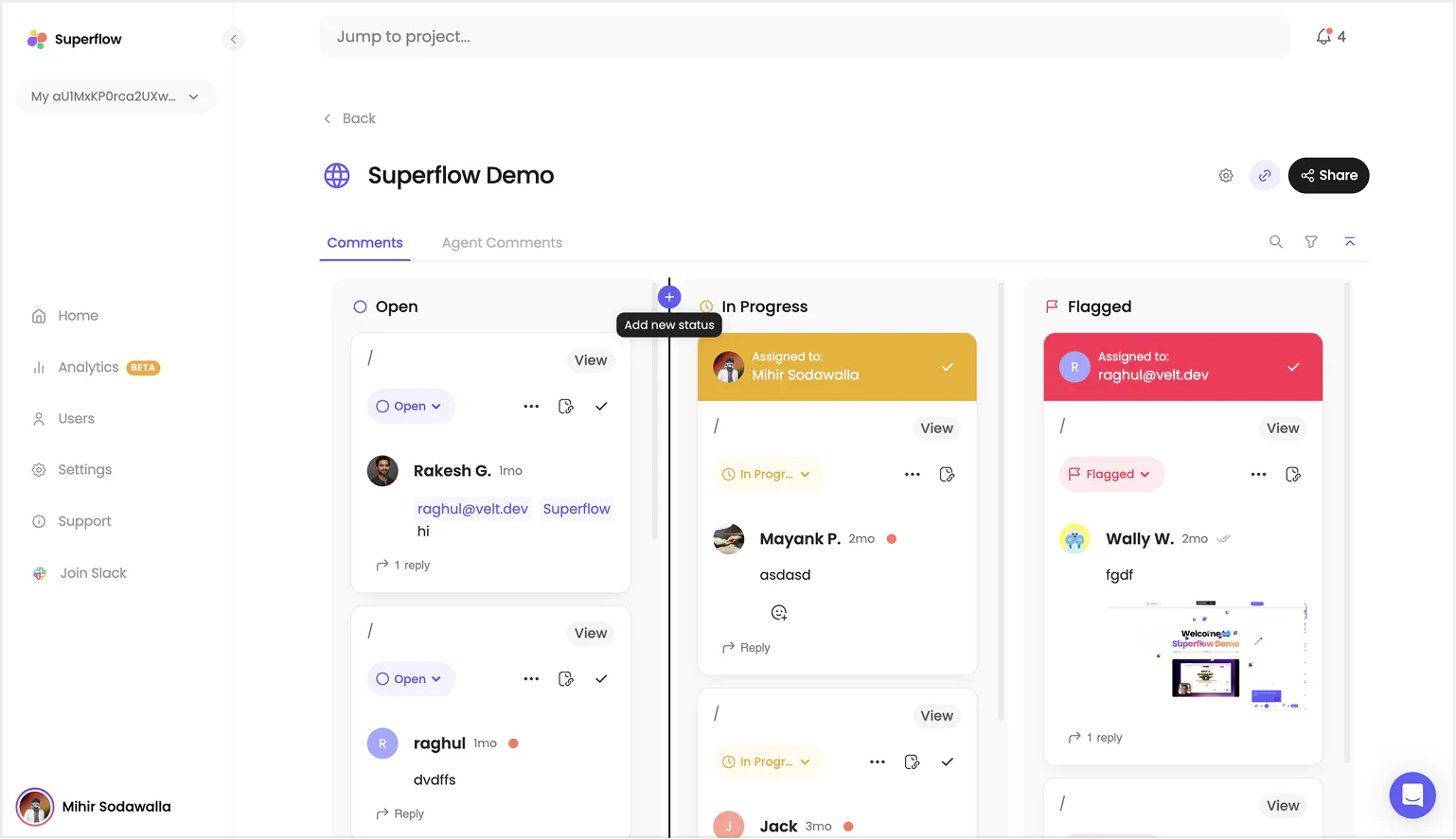
After trying multiple versions this is the final version. The biggest issue I had was ensuring all the kanban columns had enough space.
Quality of life things added:
- Custom Status & Re-ordering statuses
- Searching comments text content
- Share is the primary action
- Virtualized scroll containers for better performance
Users Page
This was the longest page of our app which shouldn't be. Old design kept two different sections for two types of users.
Given our new patterns of tabs, we can easily compress it into a single view.
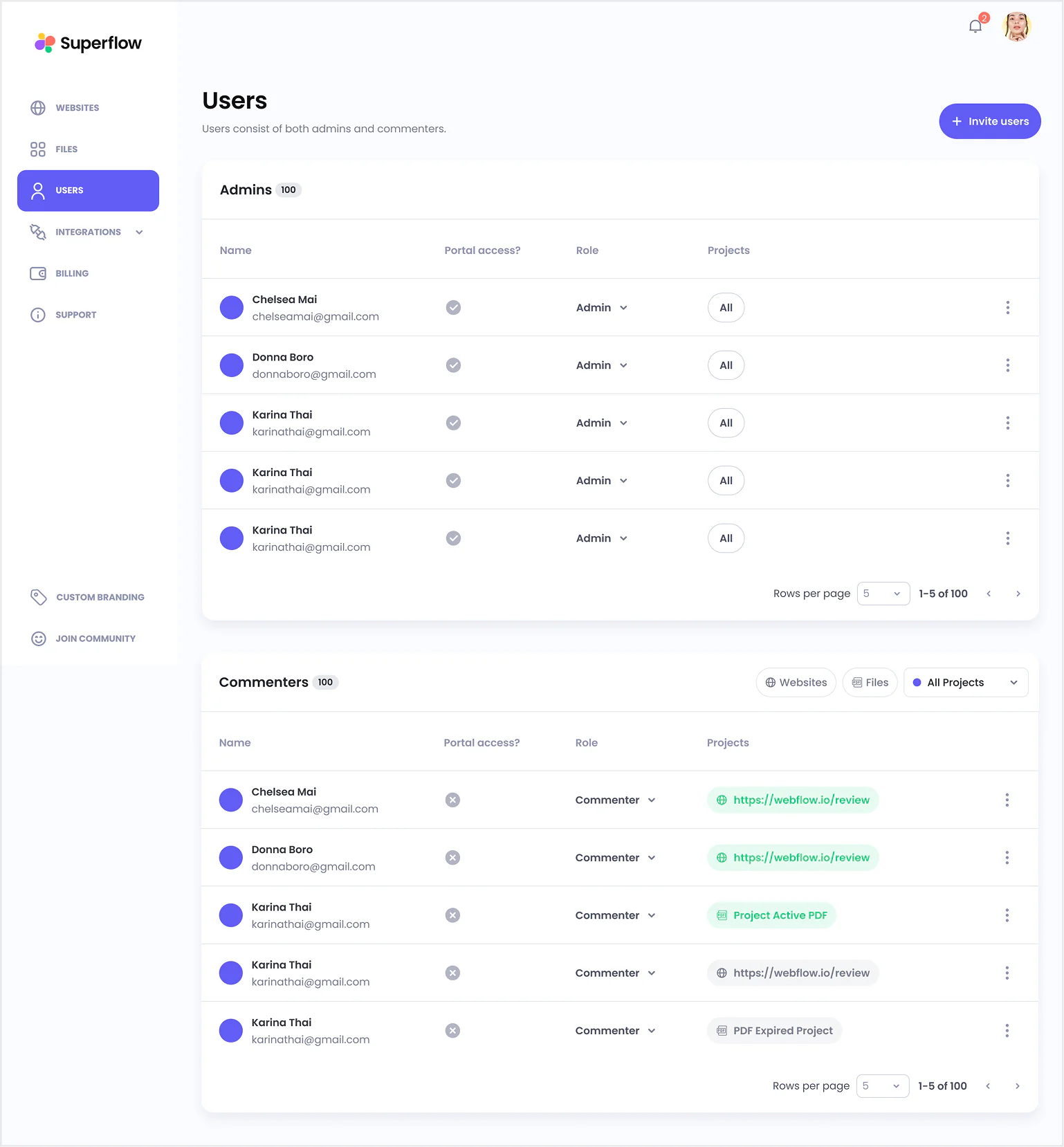
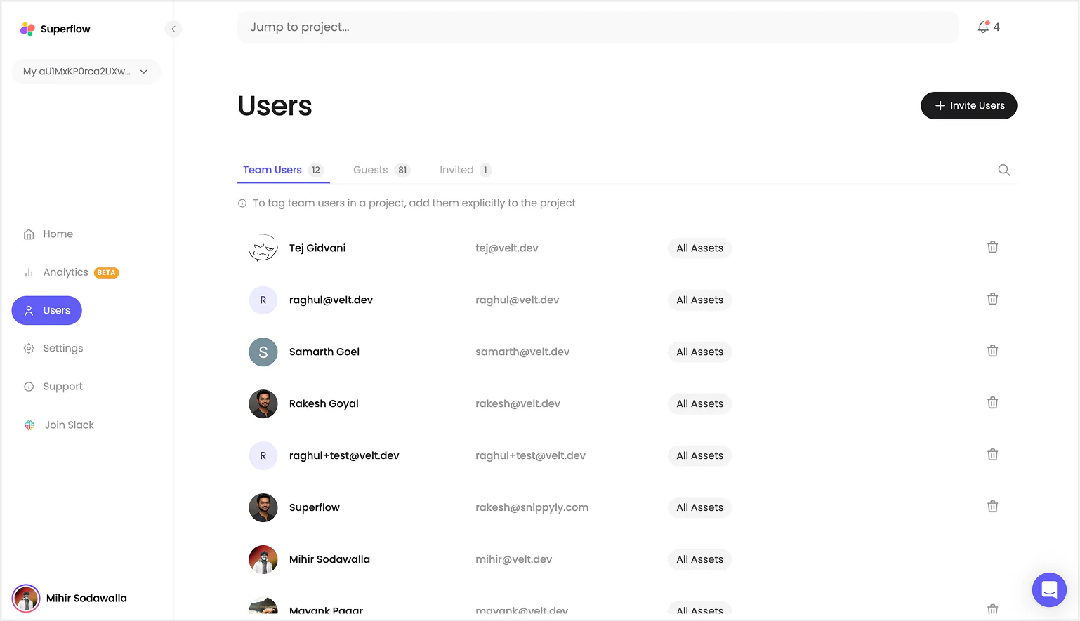
In the new view you can see team users, guests and invited laid out as tabs along with a clean list of users.
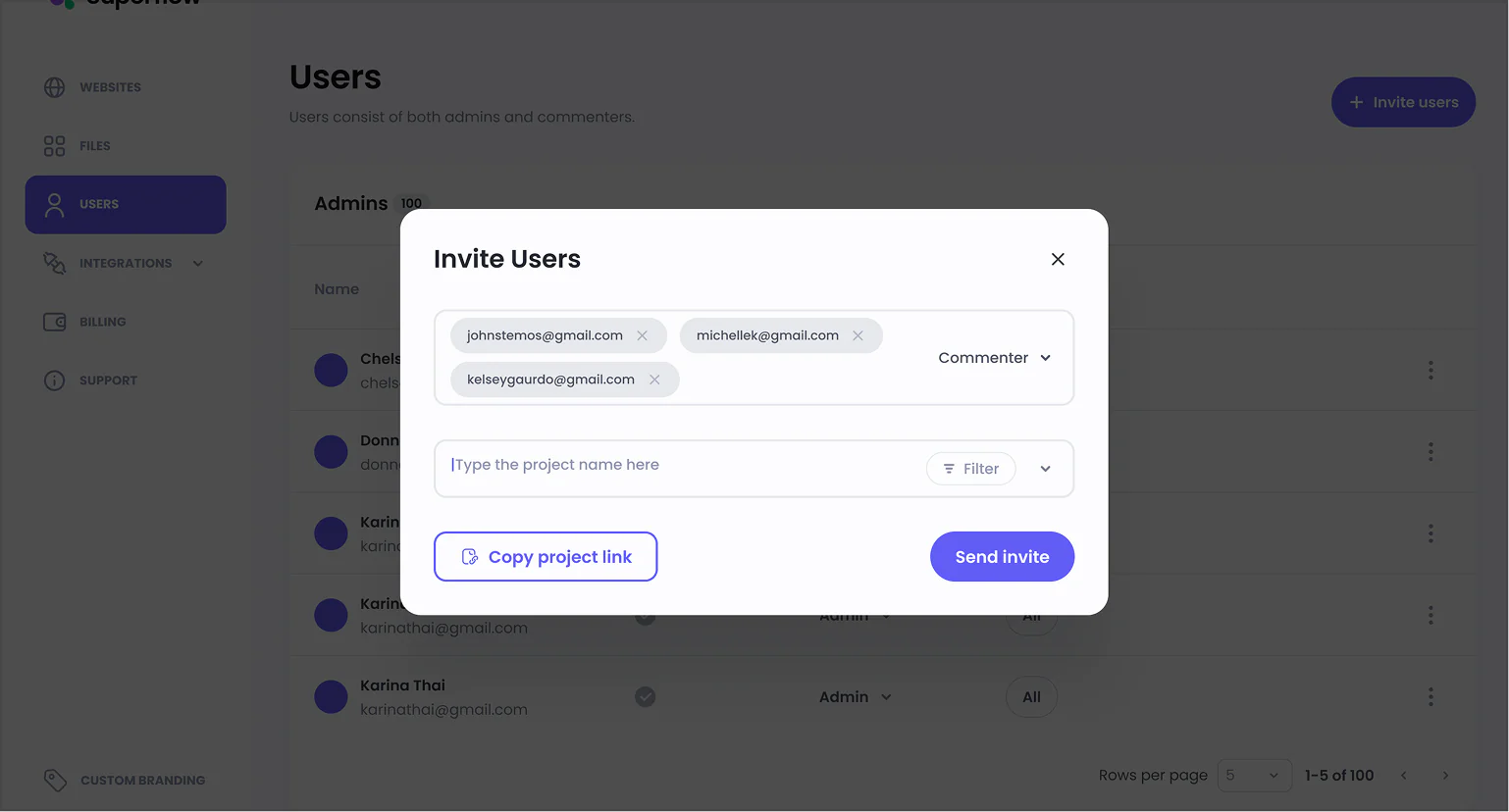
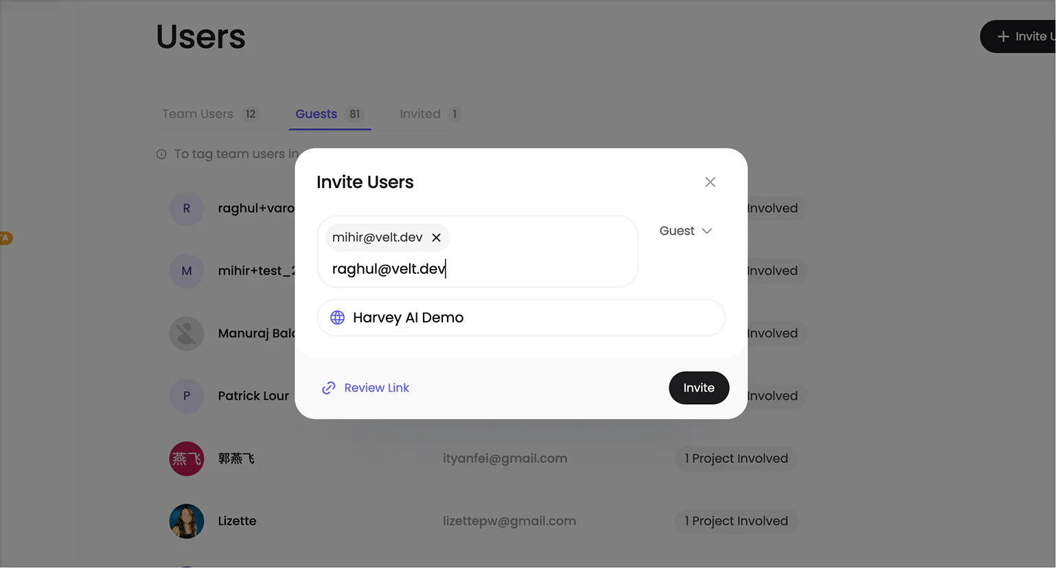
We also cleaned up the invite modal to follow a minimal and modern UI that feels less cluttered.
Little Details
As a design engineer I couldn't resist but add these small details across the portal to make it feel a bit more polished.
Here are some of my favourite ones.
Thanos Chip
When you remove a user from the input it turns into dust.
Colourful Highlights
When you select text like status, they have their own custom text highlights.
You can find more of these on my Instagram bread.ui.
Build & Deploy
Our stack was Angular + Node, deploying everything on the Google Cloud Platform.
Initially I started solo on this project and I completed ~80% of the new UI along with ~50% of the backend APIs and schema changes that were needed to facilitate the new designs.
Later our new engineer Raghul joined me to complete the new features, review code and deploy everything to production.
The entire thing took us 6 months to complete from design to production while maintaining the existing app.
New Features
A lot of small features were added along the way like switching workspace, advanced project filters, removing invites and many more, but two features that I worked on solo were Screenshot on Comment and Custom Statuses.
Screenshot on Comment
This was one of the most asked features from our customers. It was simple, when a comment is added we want to take a screenshot for that section.
We had two options:
- Build a screenshot script which takes screenshots of the DOM and sends it to the server.
- Run a browser in the backend and take a screenshot of the section.
We tried taking the first approach and replicating the html-2-canvas library but the output wasn't as we expected, it would not work consistently on websites made on Webflow and Framer, so we had to sack it.
We took the simpler second approach and used Puppeteer to open the website, take a screenshot and upload it in the comment.
Custom Statuses
Next biggest ask from our customers was to add custom statuses to match their workflows.
So I put together a custom status feature in 2 weeks where the user can create a custom status and easily use it.
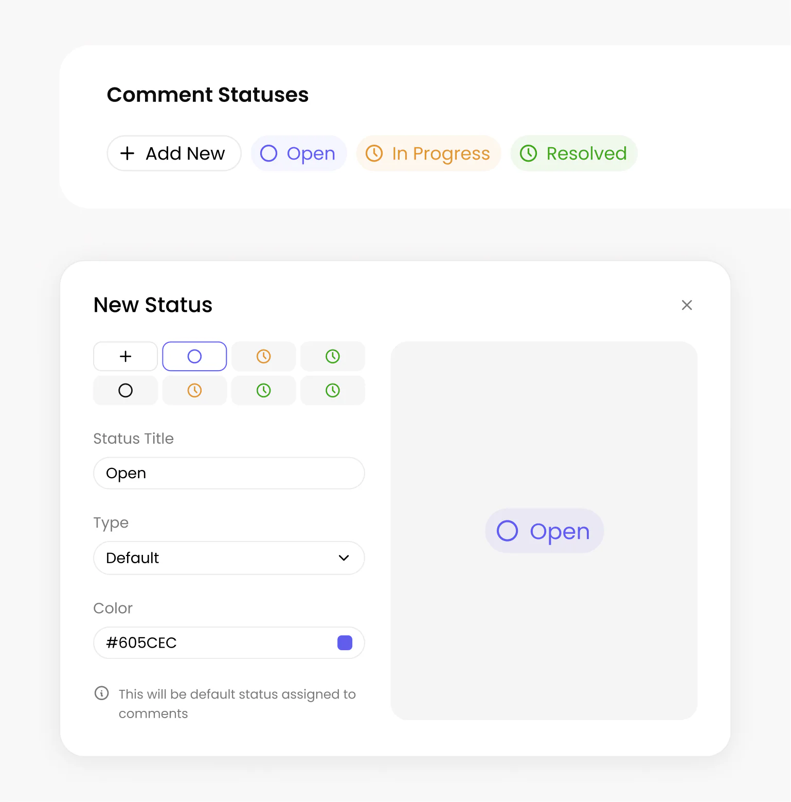
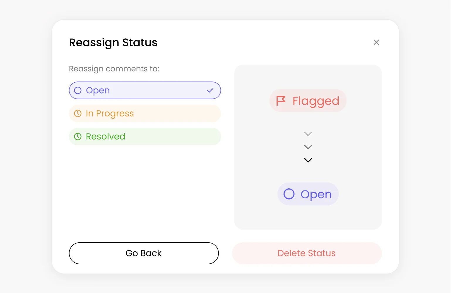
Creating the status was the easy part, but when you delete a status you have to migrate all of the comments from the current status to a different status.
This required writing cloud workers and queues to make sure all comments were correctly migrated.
Reflection
Overall it was one of the biggest engineering tasks I took on as a design engineer, and I learned a lot about writing scalable code from Raghul and the team.