Defining Visual Identity for Predflow
Discovery Call
Predflow used to be a segmentation tool for marketing teams but they have been pivoting towards becoming a D2C Agent Workflow product.
The goal for the landing page redesign was "Make it feel calm". They were worried that all the AI hype was making people anxious, so they wanted a calm, soothing website that brings peace to the visitors.

Moodboarding
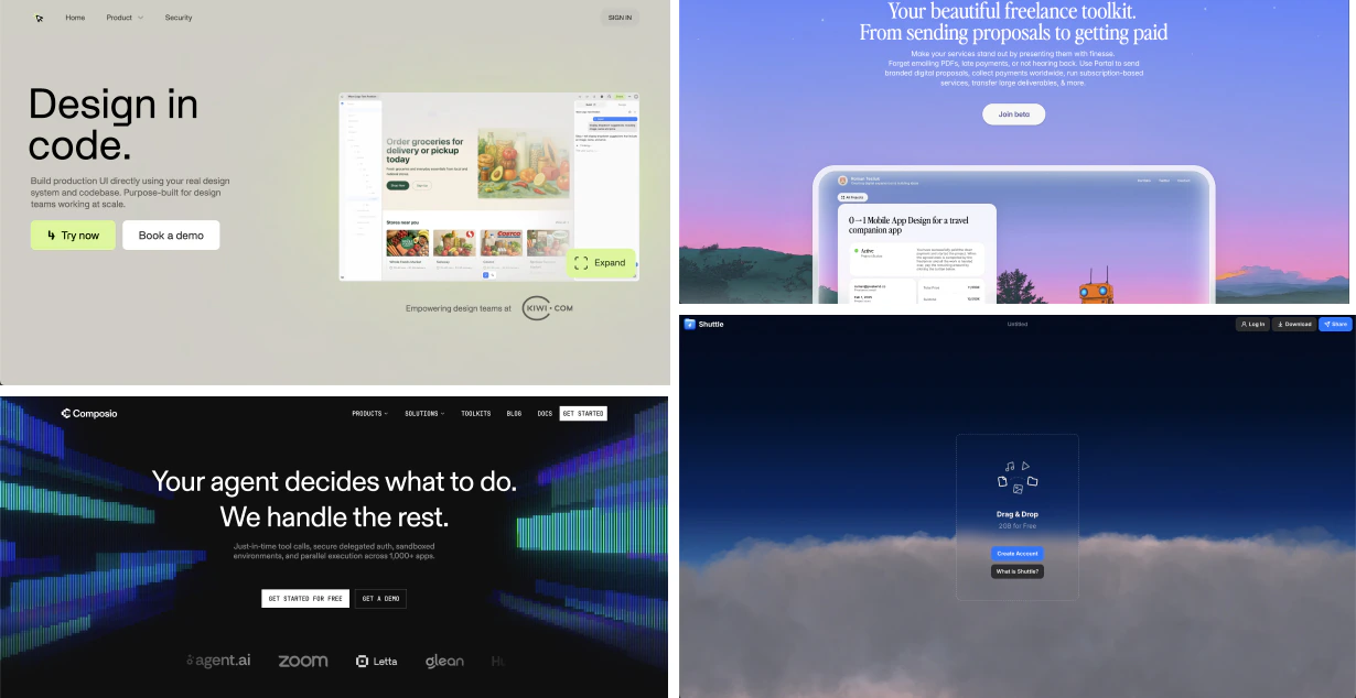
I began with creating moodboards and finding inspiration from cosmos.so, minimal.gallery, and saasui.design.
There were also websites shared by the Predflow team as inspiration.
I knew a few things that we would need to make the website stand out:
- A lot of breathing room
- Make it interactive
- Don't be lame like other SaaS and use multiple colors
Built the Aesthetics
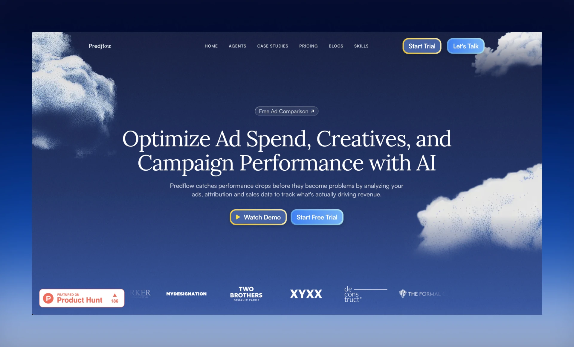
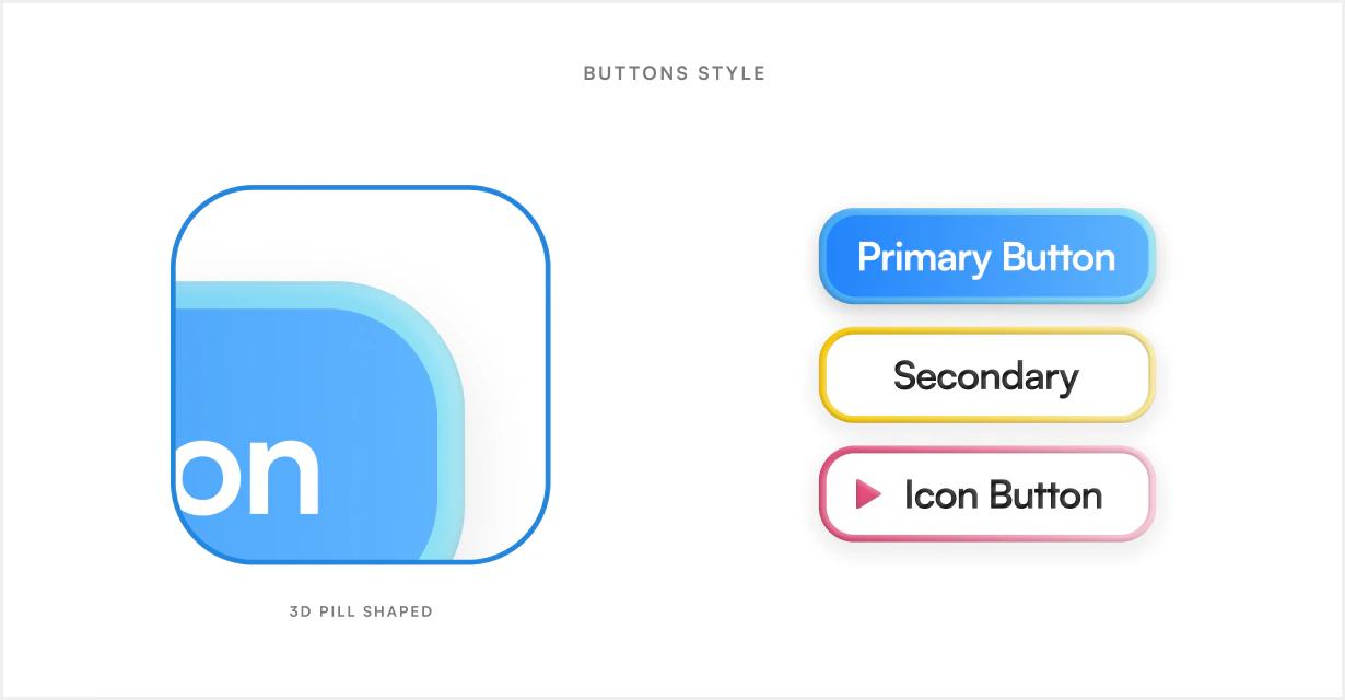
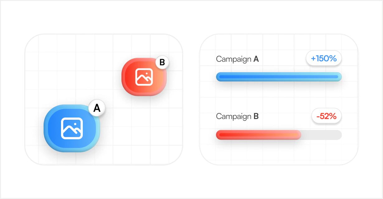
After 2 days of exploring different UI styles and visual designs, this was the design I landed on.
It's blue-themed with a pseudo-3D feel to add more depth, and uses bright colors to make it feel more playful.
The overall theme came out as a very non-SaaS-feeling website, but still feels like something a marketing team would trust.
Polish Designs in Figma
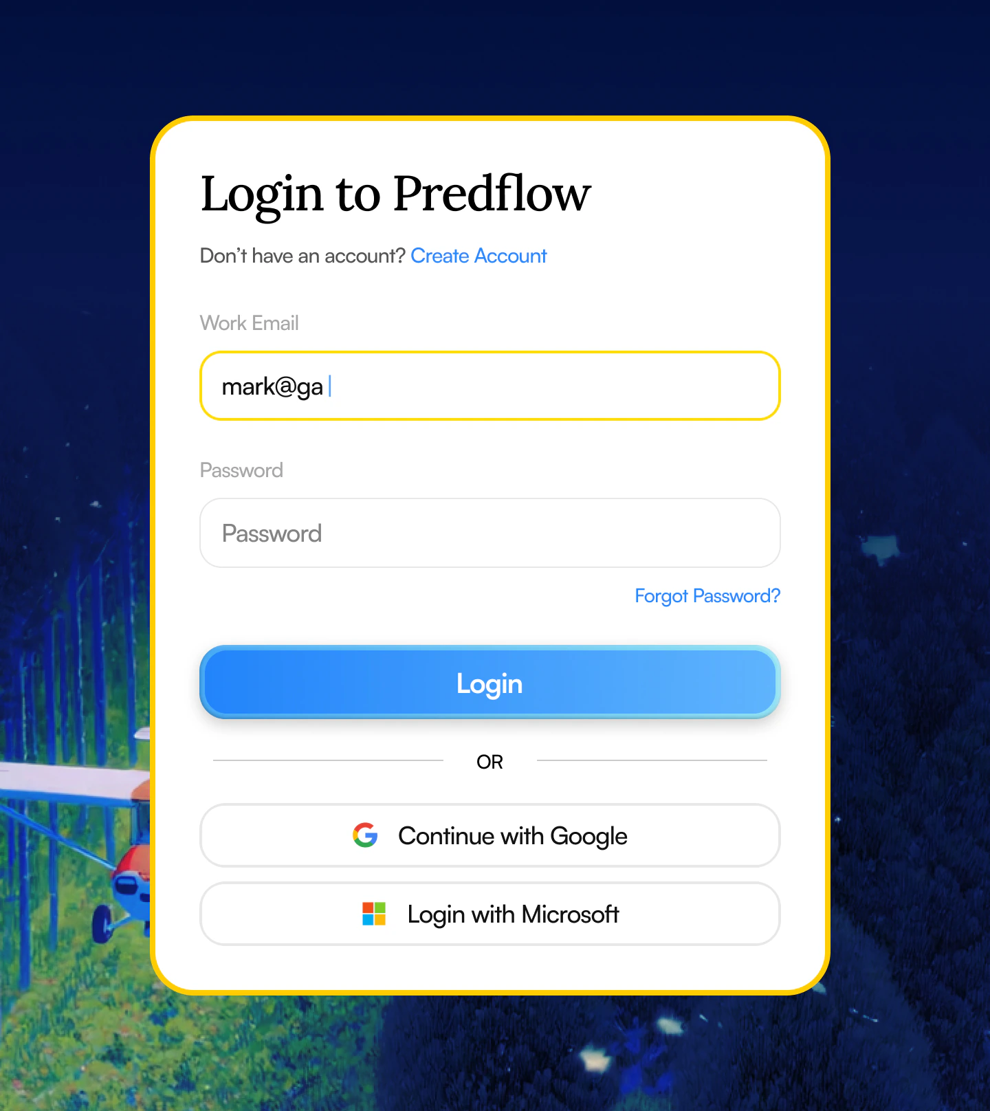
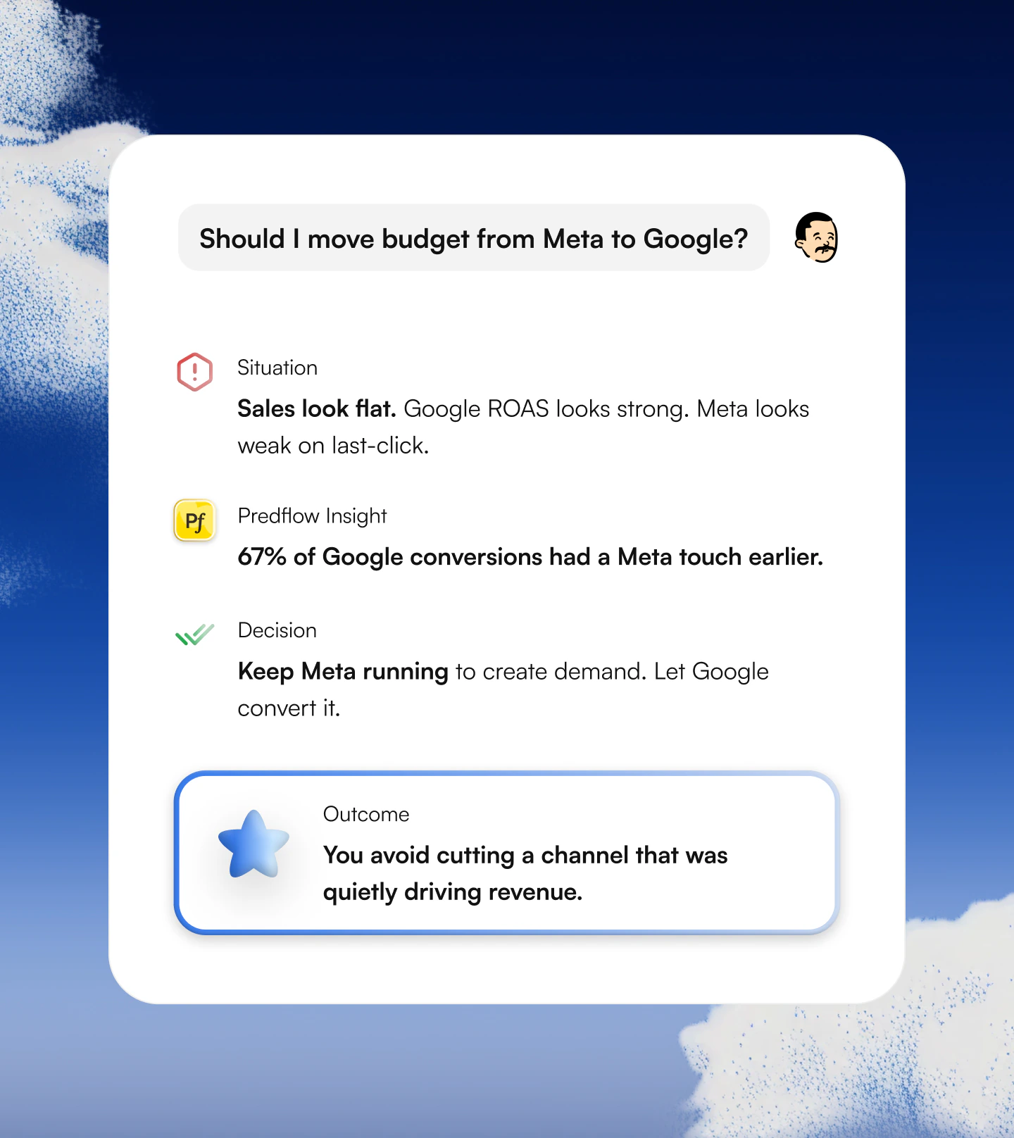
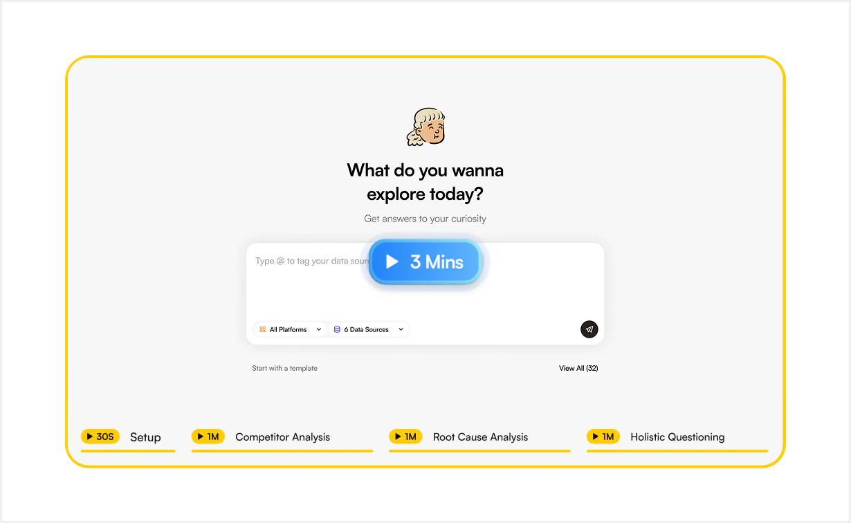
After getting the aesthetic approved, I continued with making the full website which had a duo-tone theme along with the pop of colors as we saw above.
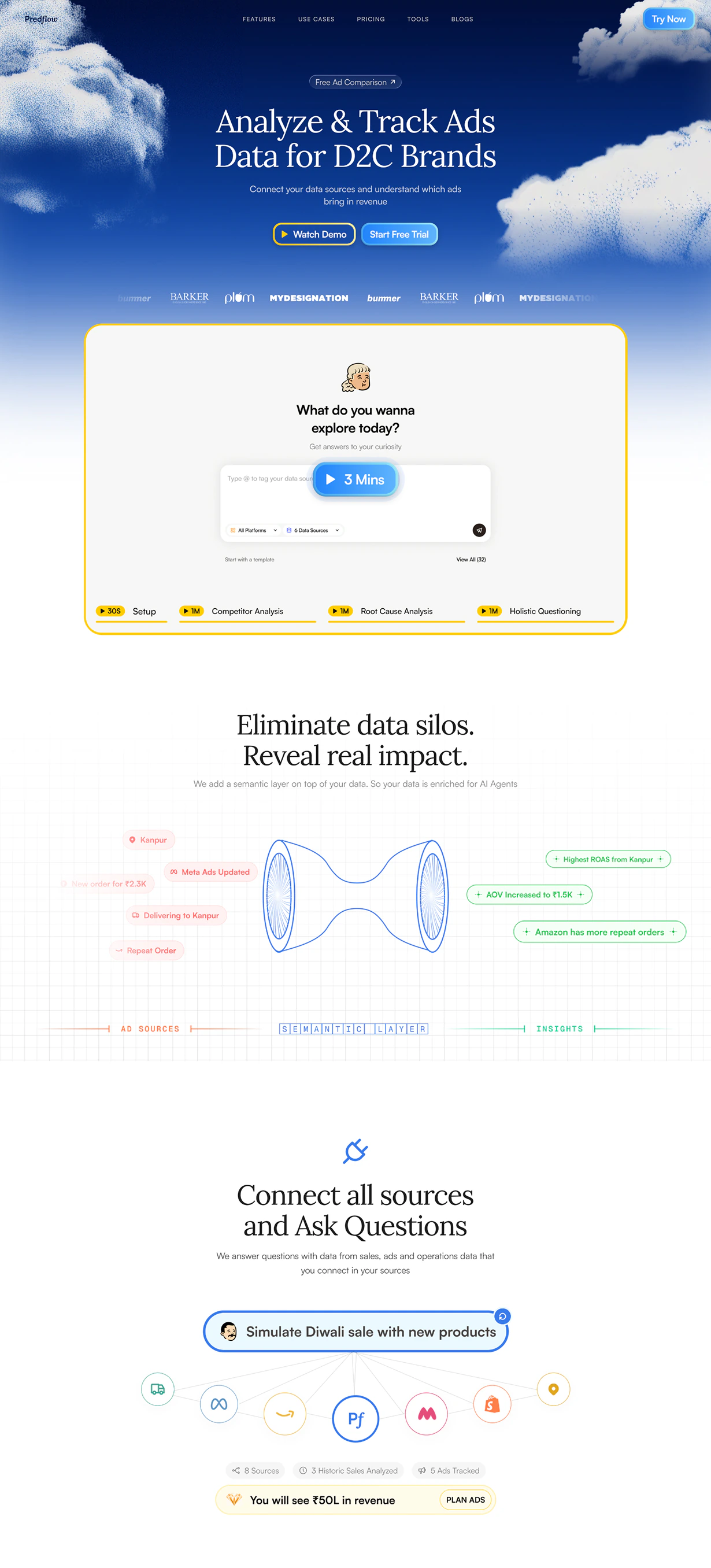
Build in Framer + CMS
After the design approval, I moved all the designs to Framer along with setting up their CMS for blogs, services and more.
You can visit the live site at predflow.ai.