Logo Pitch for HemmSphere
Framing the Relationship
I just wanted to take them through the process of how a logo gets built. Usually this happens inside a full branding process, but for this pitch I took the liberty of taking a shot at it directly.
For the logo identity of HemmSphere, the first thing I wanted to look at was the relationship between HemmSphere and the industry it operates in. The mark had to come from that, not from styling.

Finding the Core Idea
So the primary question for our identity becomes, what does HemmSphere bring?
Now I know HemmSphere solves a lot of problems and makes life easier, but at the core, what does it bring?
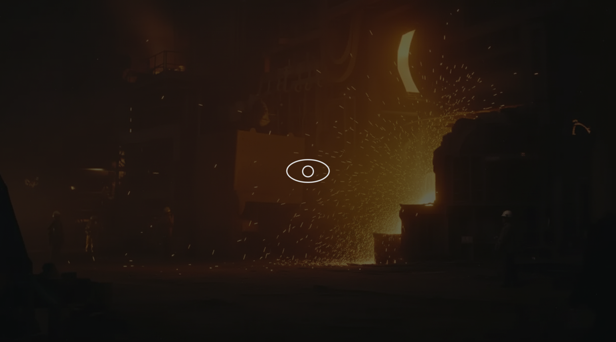
As per my understanding, it is visibility. Visibility across different OEMs, vehicles, processes and what not. It is the source of truth for all of your hemms.
Translating Visibility into Form
Visibility has a very natural visual metaphor, the eye. So the first important shape becomes the outline of an eye.
Representing the Industry
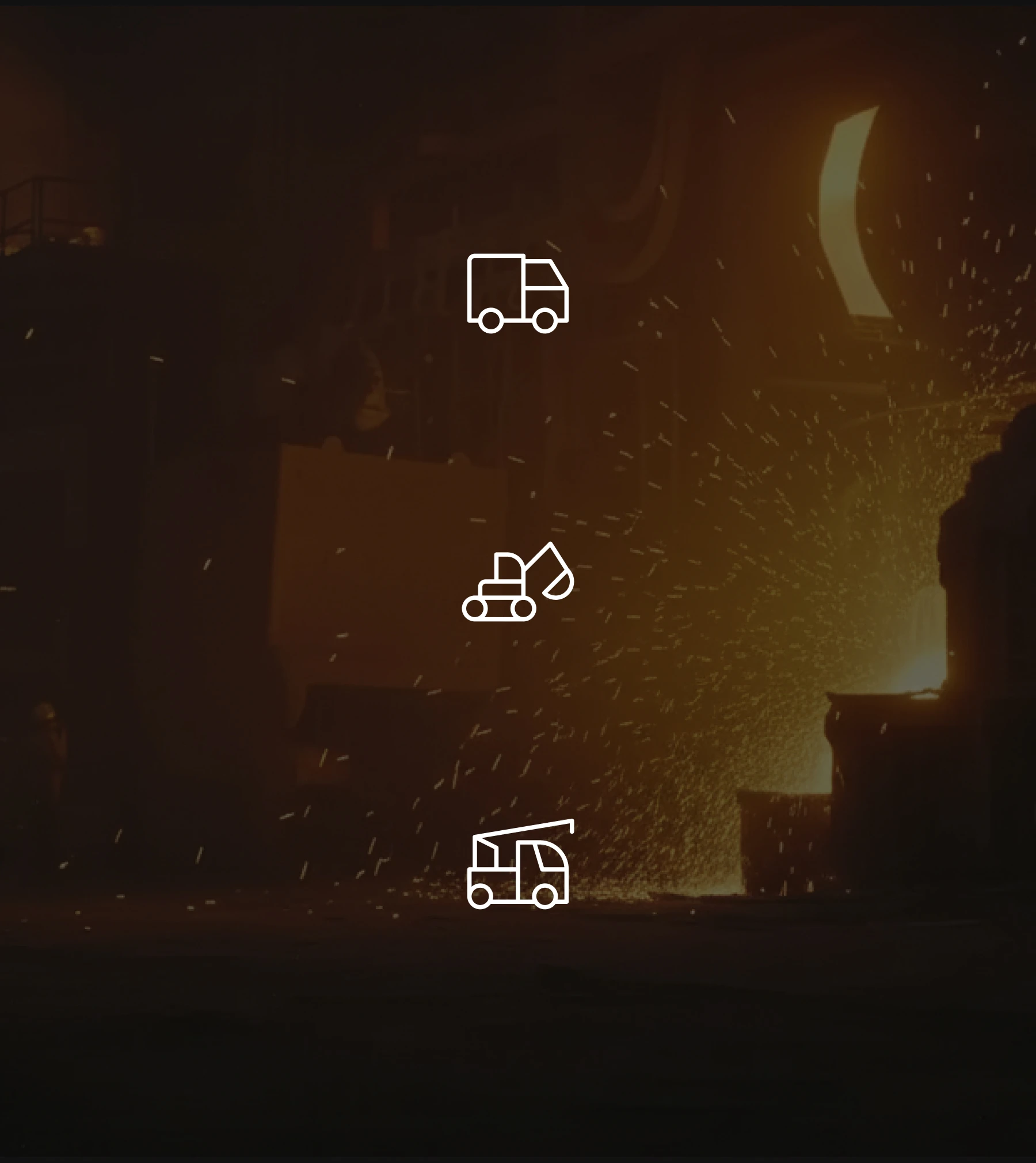
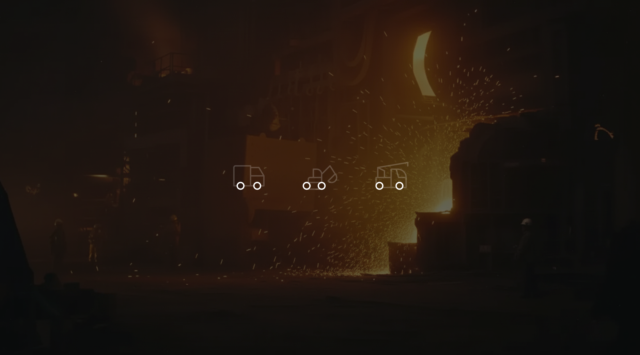
Now the second part of the identity is the machinery, which is at the core of our offerings.
It is complicated to get a single identifier for it though, since the machines are so different. Trucks, excavators, dumpers, loaders, they all live in the same world but they don't look alike.
The Common Denominator
But there is one common thing across all of them, and that is the tyre.
A circle. Universal, recognisable, and quietly a symbol of motion.
The Puzzle Pieces
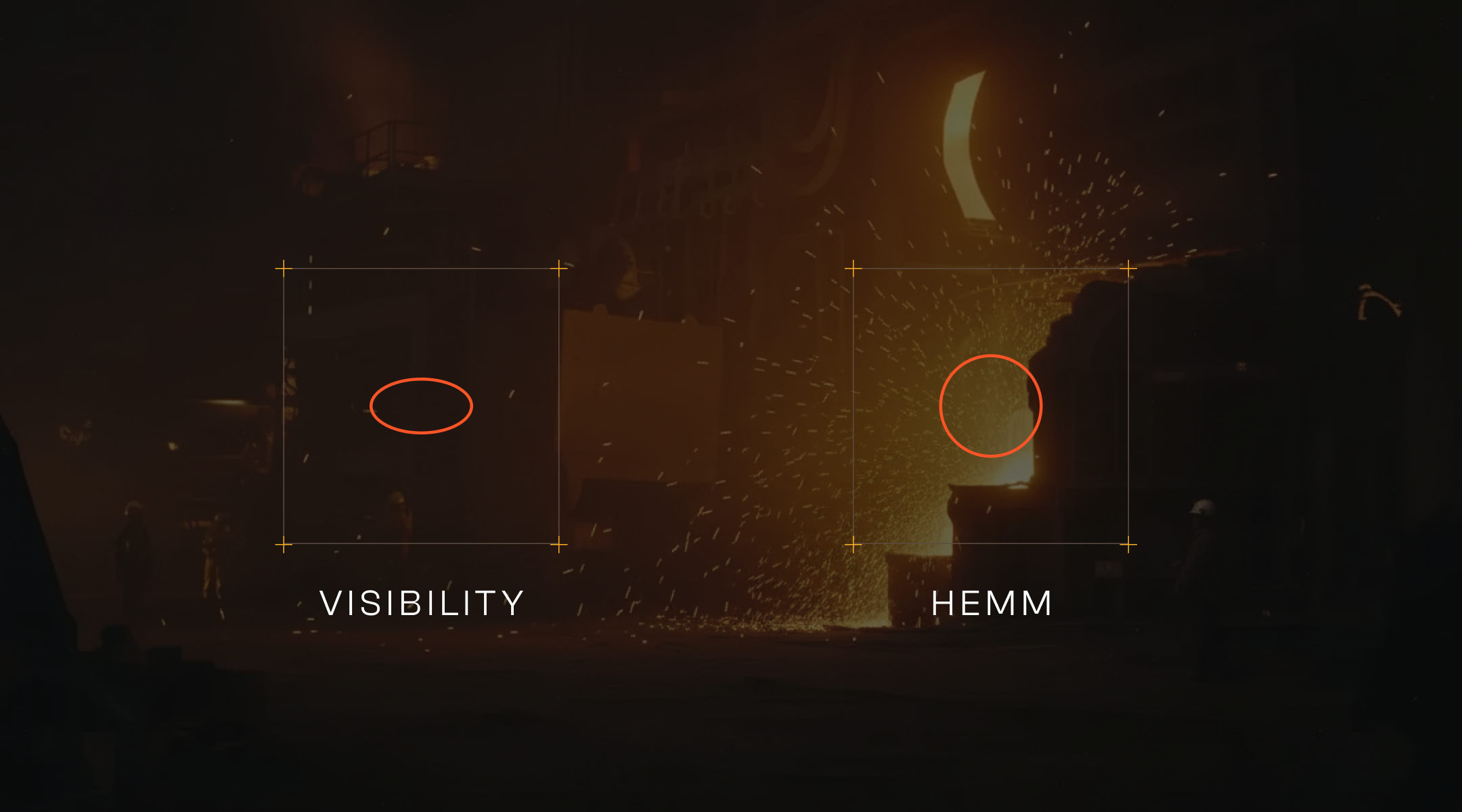
So now we have the puzzle pieces to build our logo.
- The eye, for visibility
- The circle, for hemm (machinery)
Using these we should be able to represent the essence of HemmSphere, and from what I understand, we take care of a lot of things.
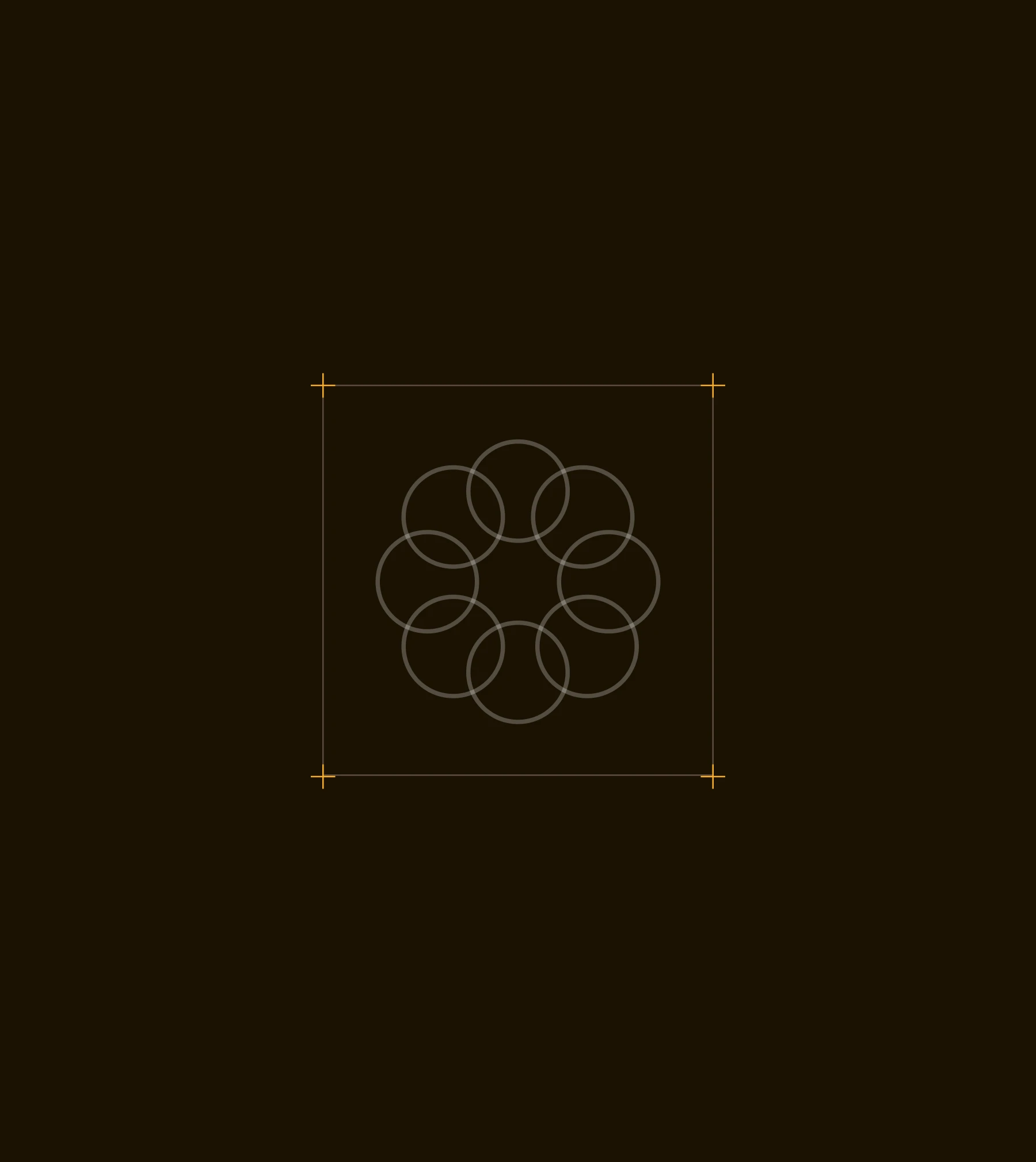
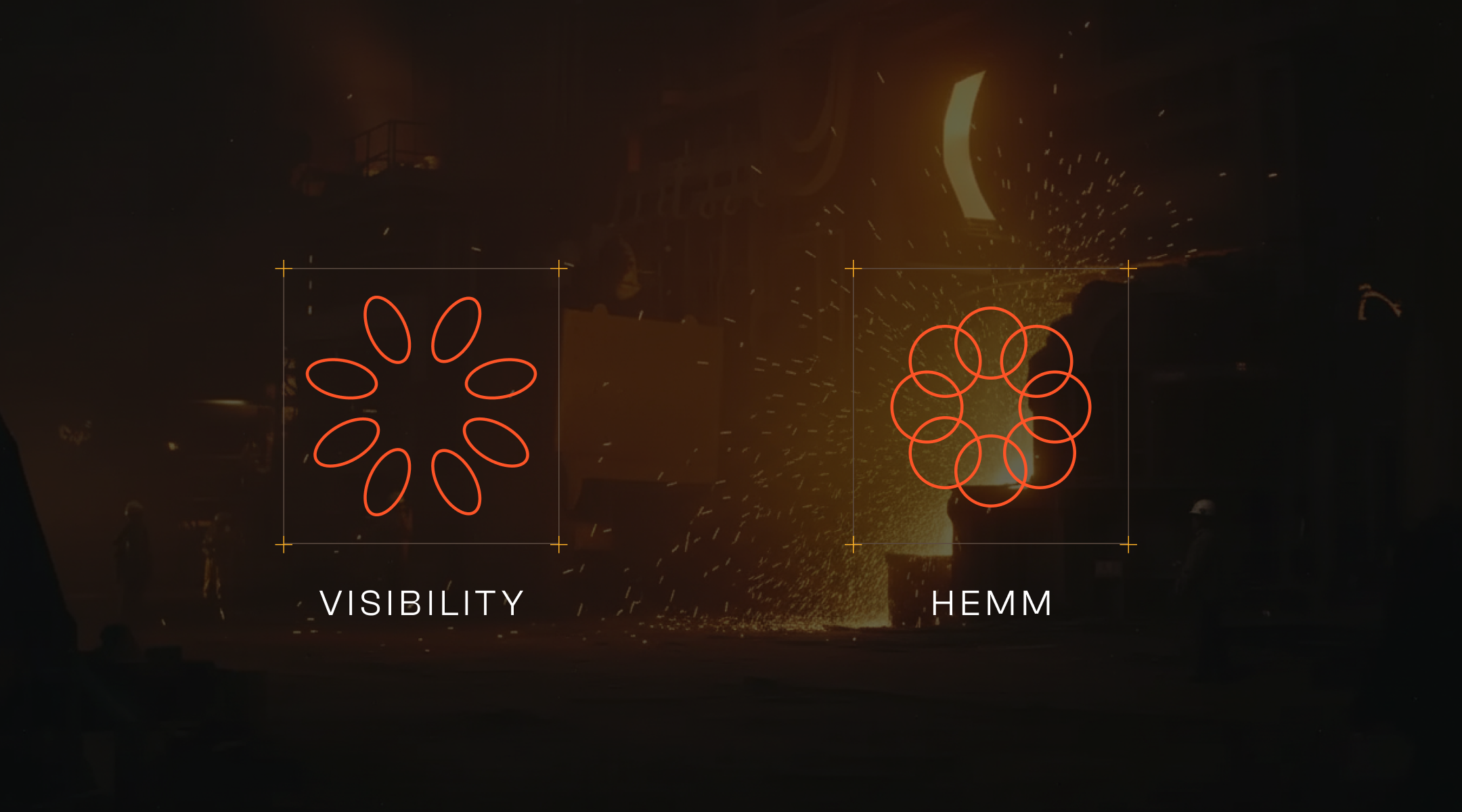
The 8x Multiplier
So each of these symbols are replicated 8 times.
HemmSphere is about optimising time, increasing productivity, but essentially it is about moving forward. The 8-fold rotation reads as motion, gears, and momentum.
The Final Mark
The two replicated forms come together into a single symbol. A mark that feels flower-like, gear-like and eye-like all at the same time, paired with a bold industrial wordmark.
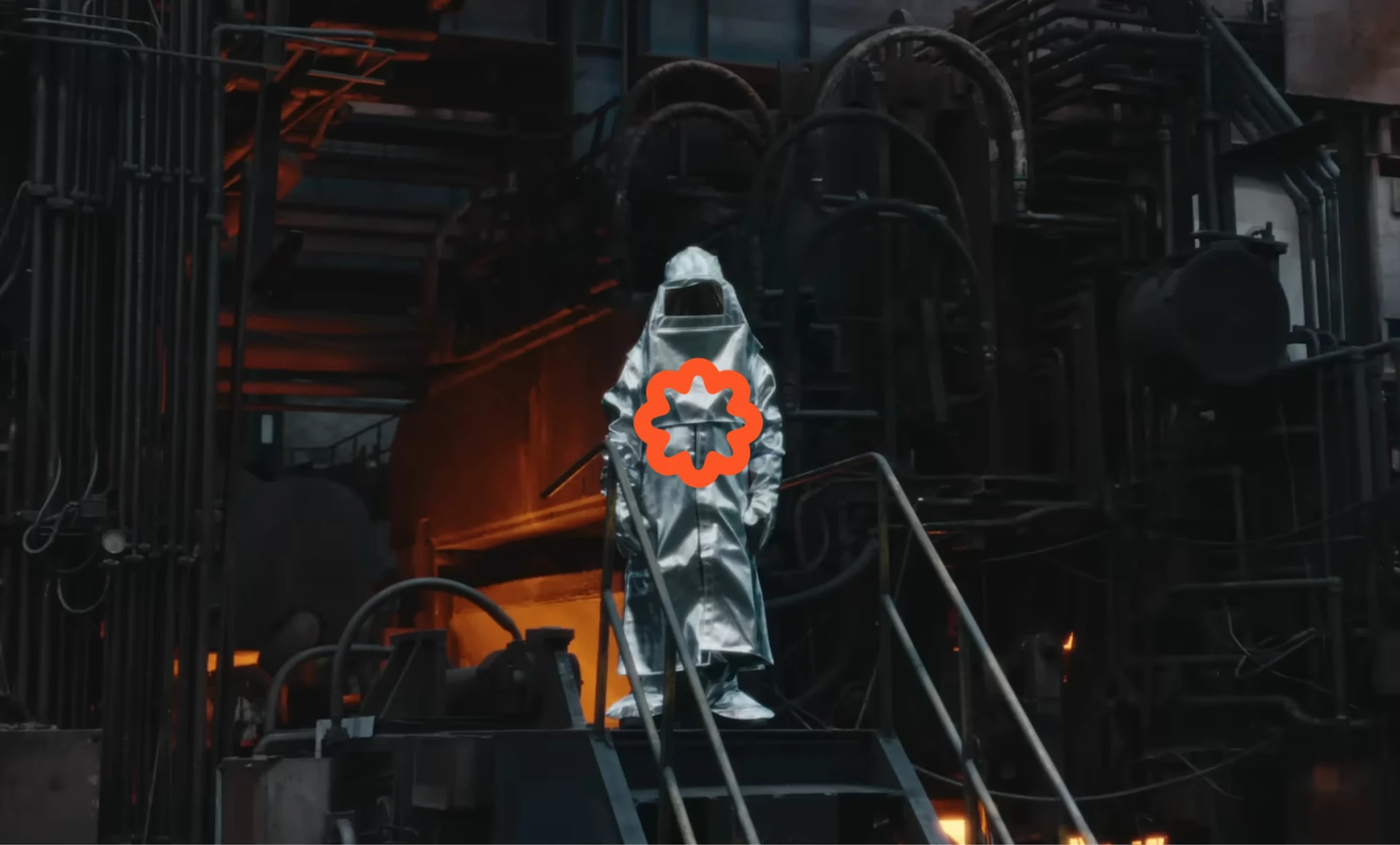
A high-contrast orange mark that can hold its ground against the dust, sparks and steel of the environments HemmSphere operates in.
Reveal Film
Along with the logo, I put together a short reveal film that drops the mark into a working foundry, so the brand sits inside the exact world it serves.
Credits
The footage used in the reveal film is from Jindal Steel | The Steel Of India | Brand Film. All rights to the original footage belong to its respective owners. This was a personal pitch concept and is not affiliated with Jindal Steel.