Healthcare at fingertips
What's A2Z Meds
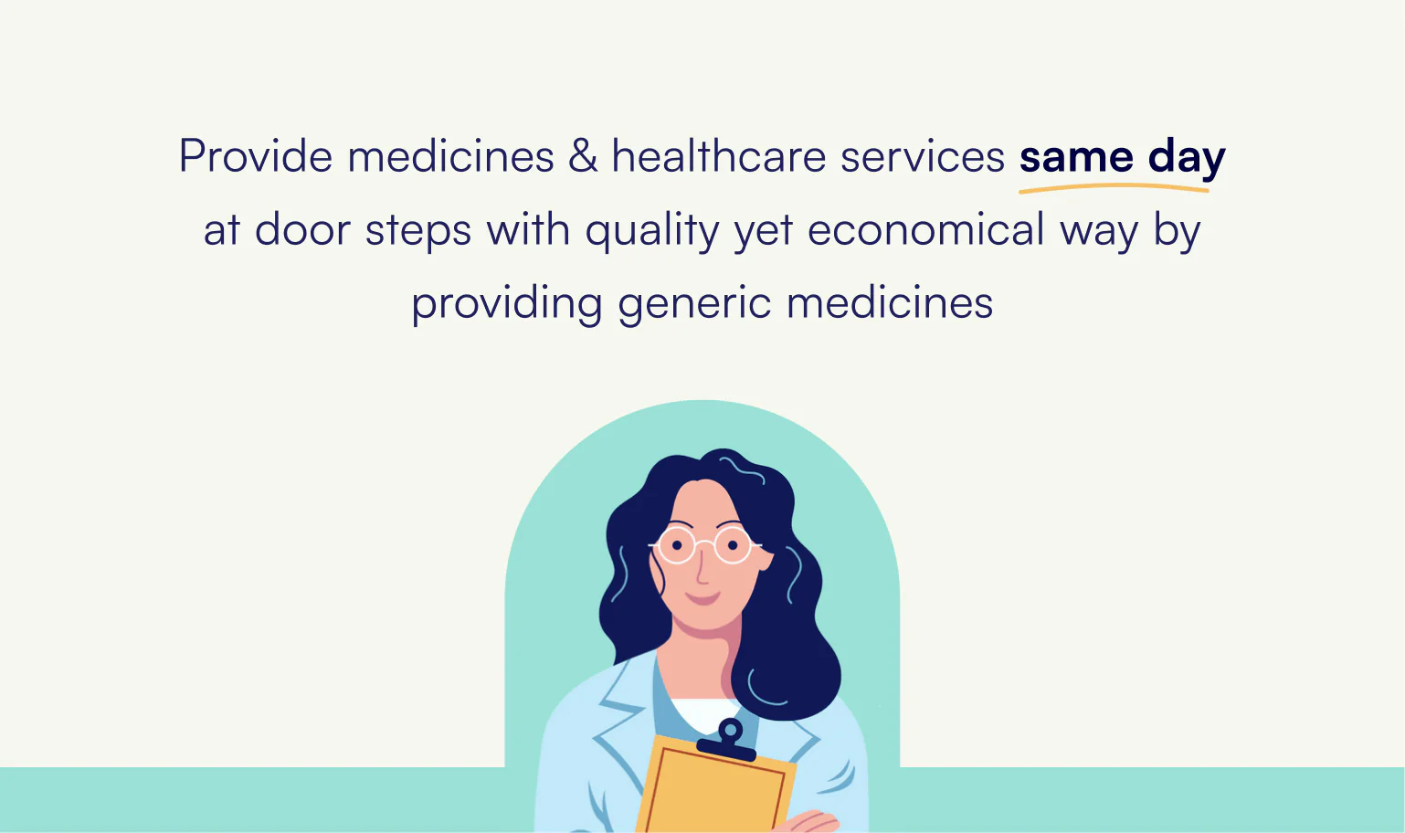
A2Z Meds is a small startup in India that provides consumer healthcare services. They deliver off-the-shelf medicines within an hour and book tests at your home at a discounted price.
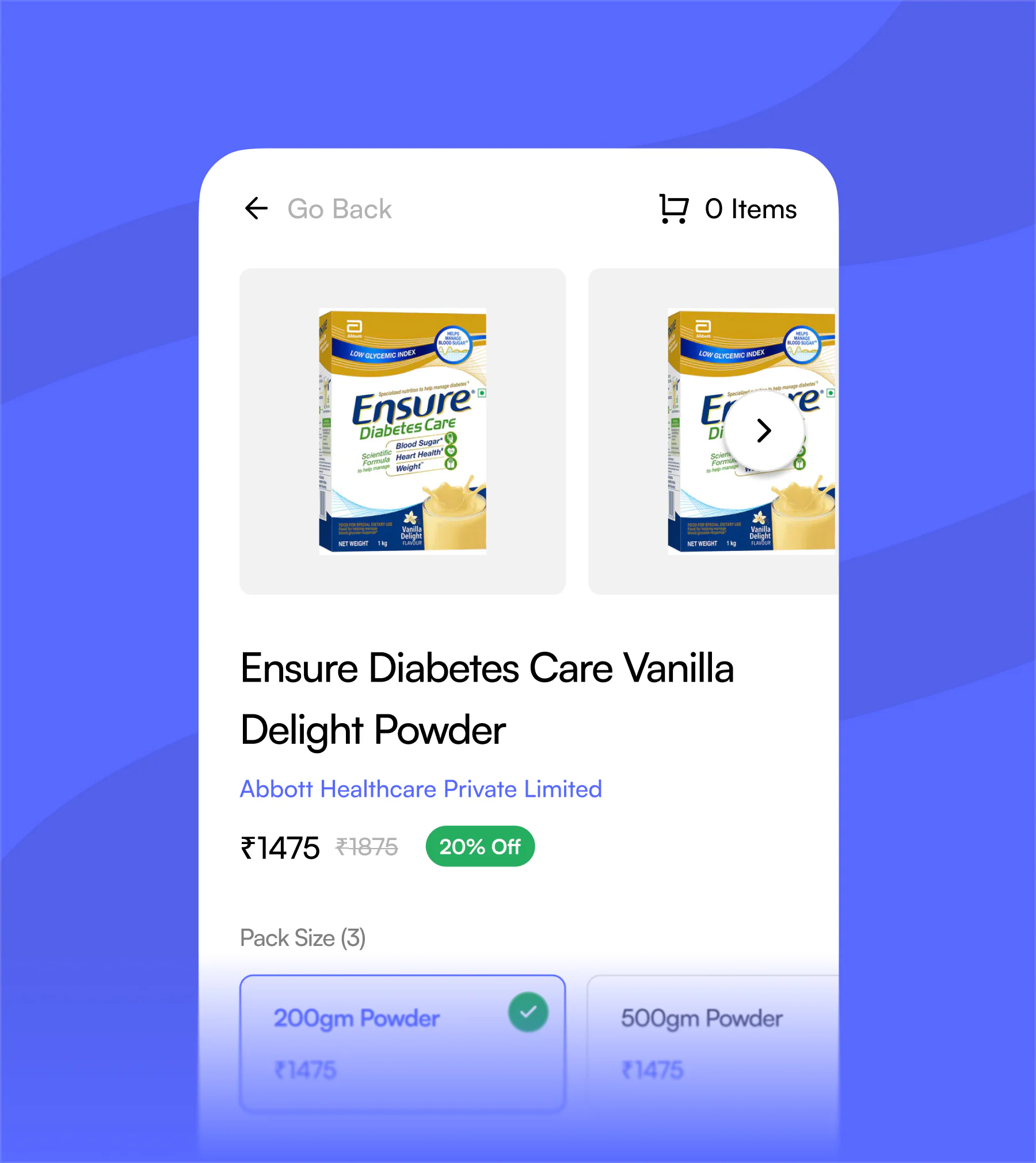
They also push generic medicines instead of expensive branded ones, so everyone can afford healthcare.
The founders came to me with a simple ask: build a web app that feels modern and carries the UX standards of the big healthcare startups.
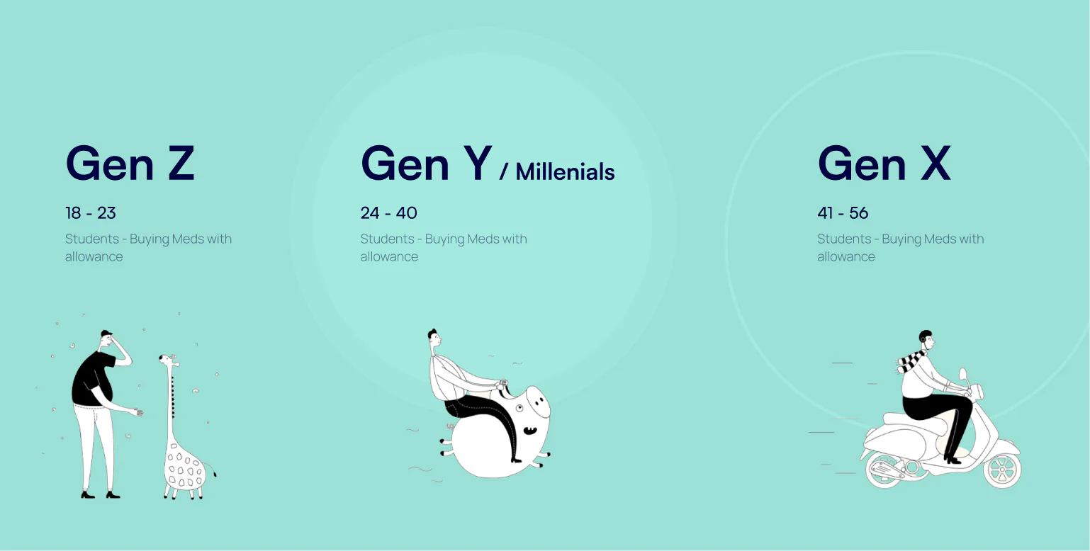
User Segments
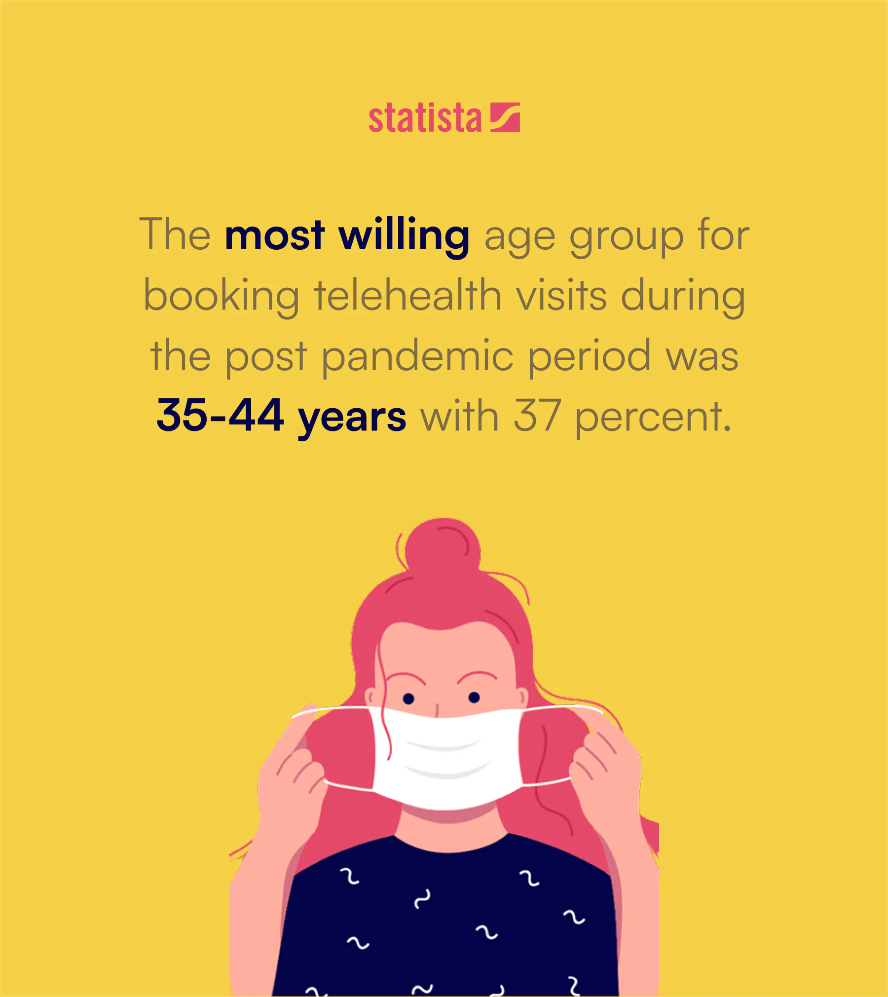
The first step was to understand what the user landscape looked like. One statistic from Statista stood out (and matched the obvious hypothesis):
The most willing age group for booking telehealth visits during the post pandemic period was 35 to 44 years, with 37 percent.
So our primary target user was the millennial cohort. They are tech savvy and they also buy medicines on behalf of the other two groups (children and elderly parents).
JTBD & How Might We
After researching and discussing with the client, we came up with three Jobs To Be Done statements.
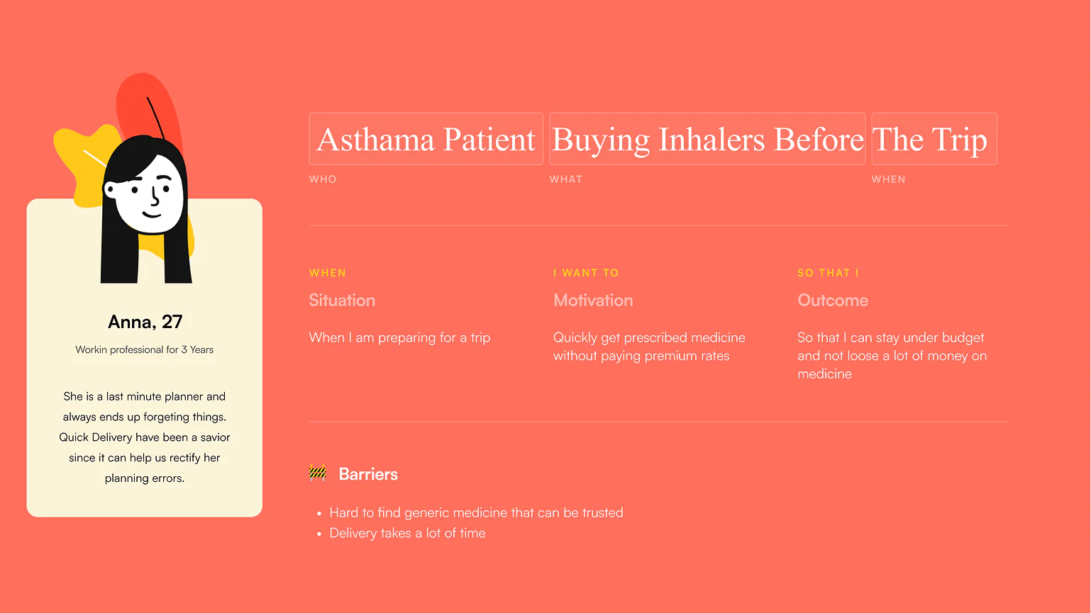
JTBD #1
When I am preparing for a trip, I want to quickly get my prescribed medicine without paying premium rates, so that I can stay under budget and not lose a lot of money on medicine.
JTBD #2
Every two weeks I have to order medicines recommended by the doctor, so that we can stock a week of supplies for my grandfather.
JTBD #3
When I am coming back from my doctor's appointment, I want to grab some medicine for my psoriasis and book a test, so that by the time I reach home my medicine is ready and I don't have to worry about appointments.
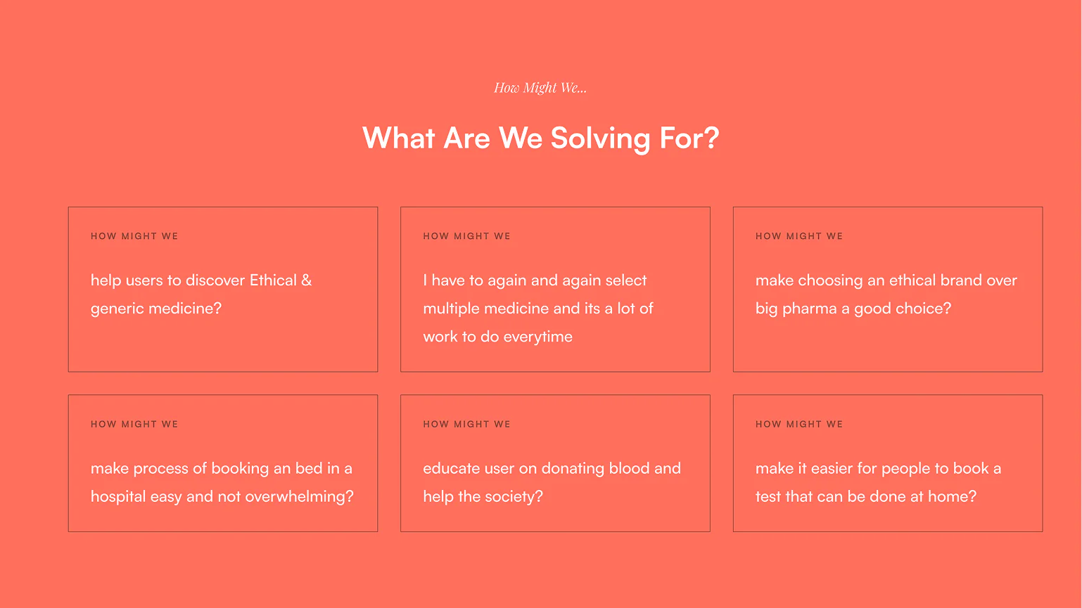
From these, we wrote a set of How Might We statements to crystallize what we were actually trying to solve.
Overall they fell into three categories:
- Pushing ethical and generic medicines
- Ensuring a dosage is never missed
- Making tests feel as simple as an Amazon delivery
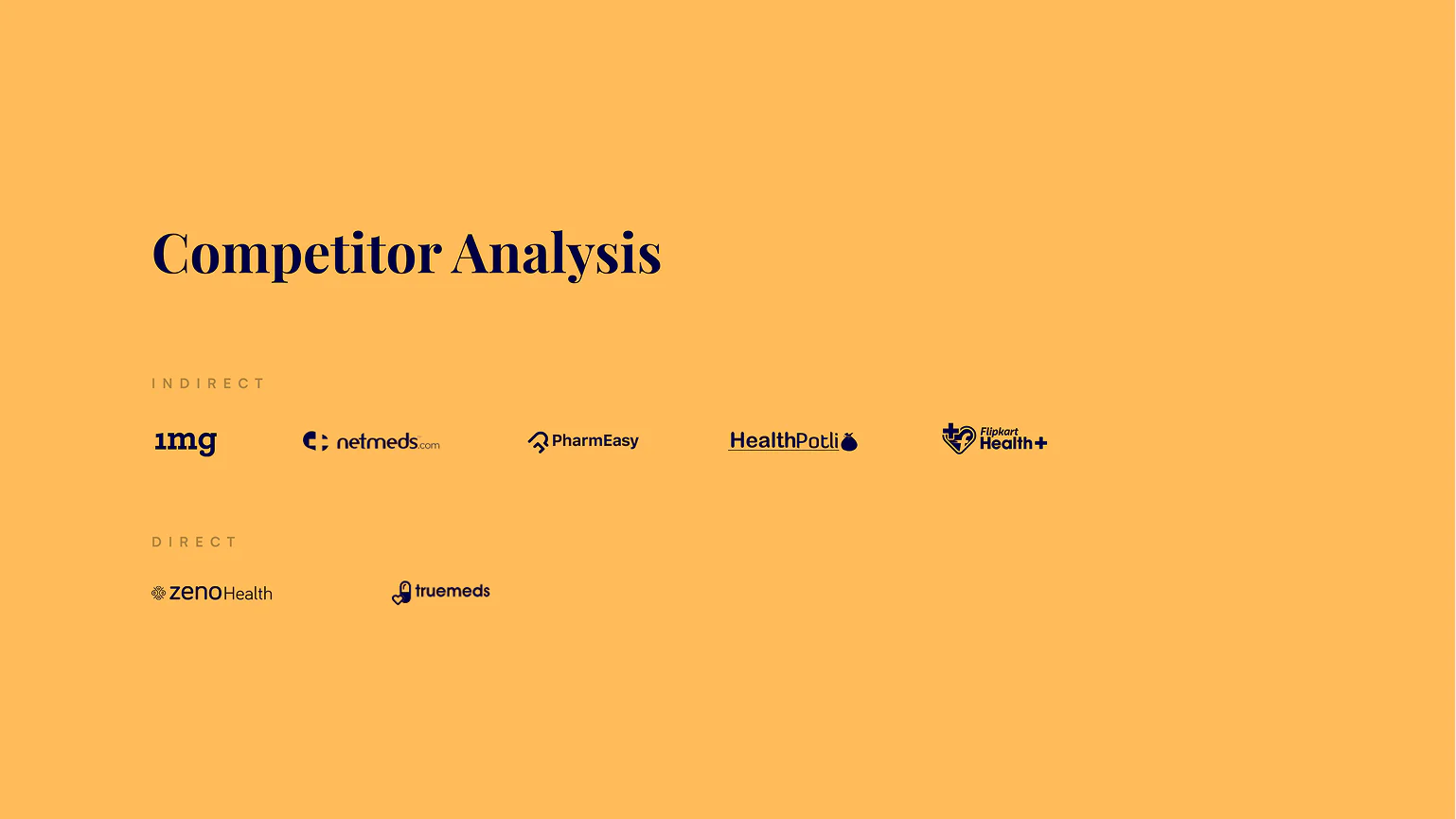
Benchmarking
We looked at both direct and indirect competitors to see what we could learn from them.
Four themes emerged from the benchmarking:
- Prioritizing information visibility
- Anticipating user behaviour
- Ease of discoverability
- Personalized flows
You can view the detailed benchmarking here.
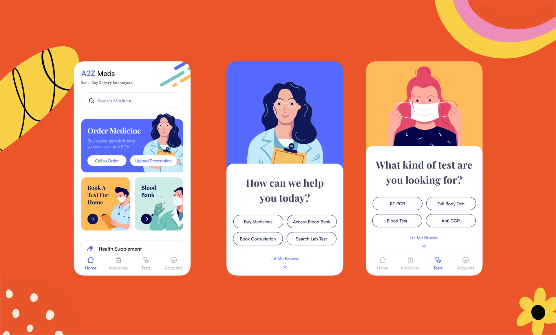
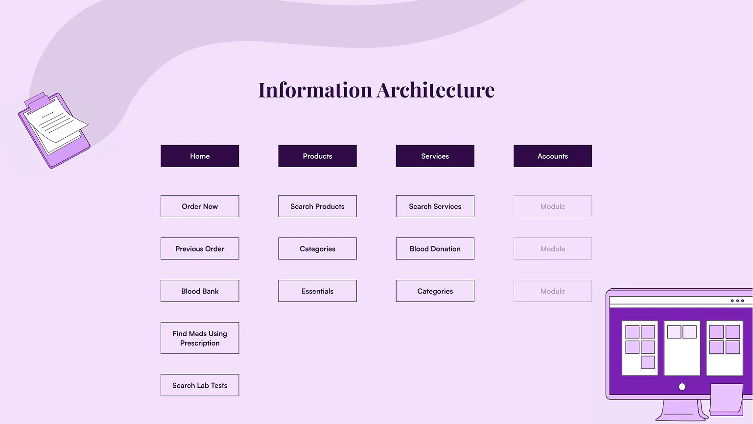
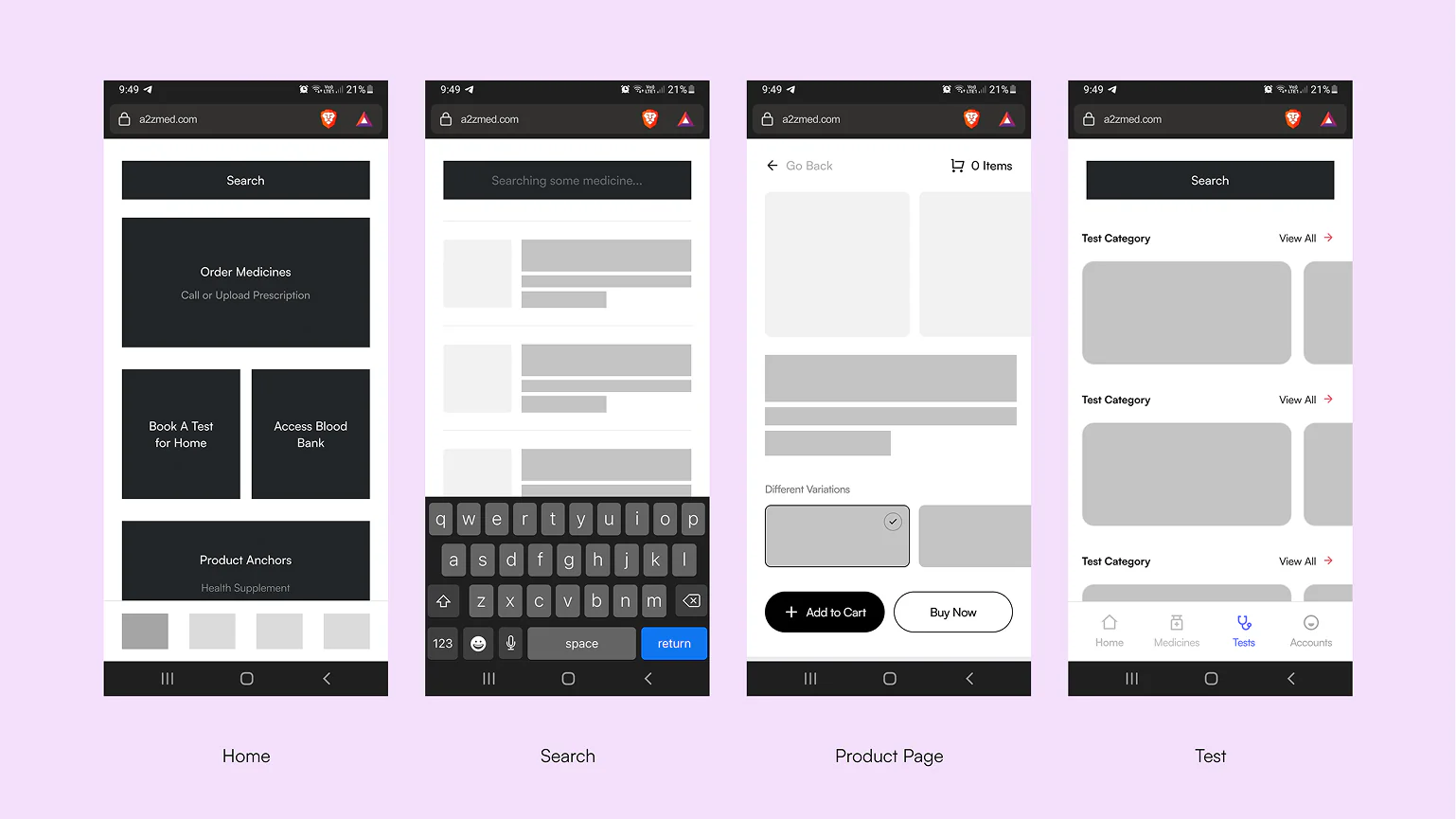
IA & Wireframes
With the research in place, I laid out the information architecture and user flows for the web app and moved into wireframes for every screen, so we could agree on where each piece of information would sit before any UI work began.
Interface Design
Once everything was finalized, I went ahead and designed the rest of the flows and pages for the website.
The aesthetic follows the industry standard: soft corners so it feels welcoming, paired with a familiar, neutral blue.
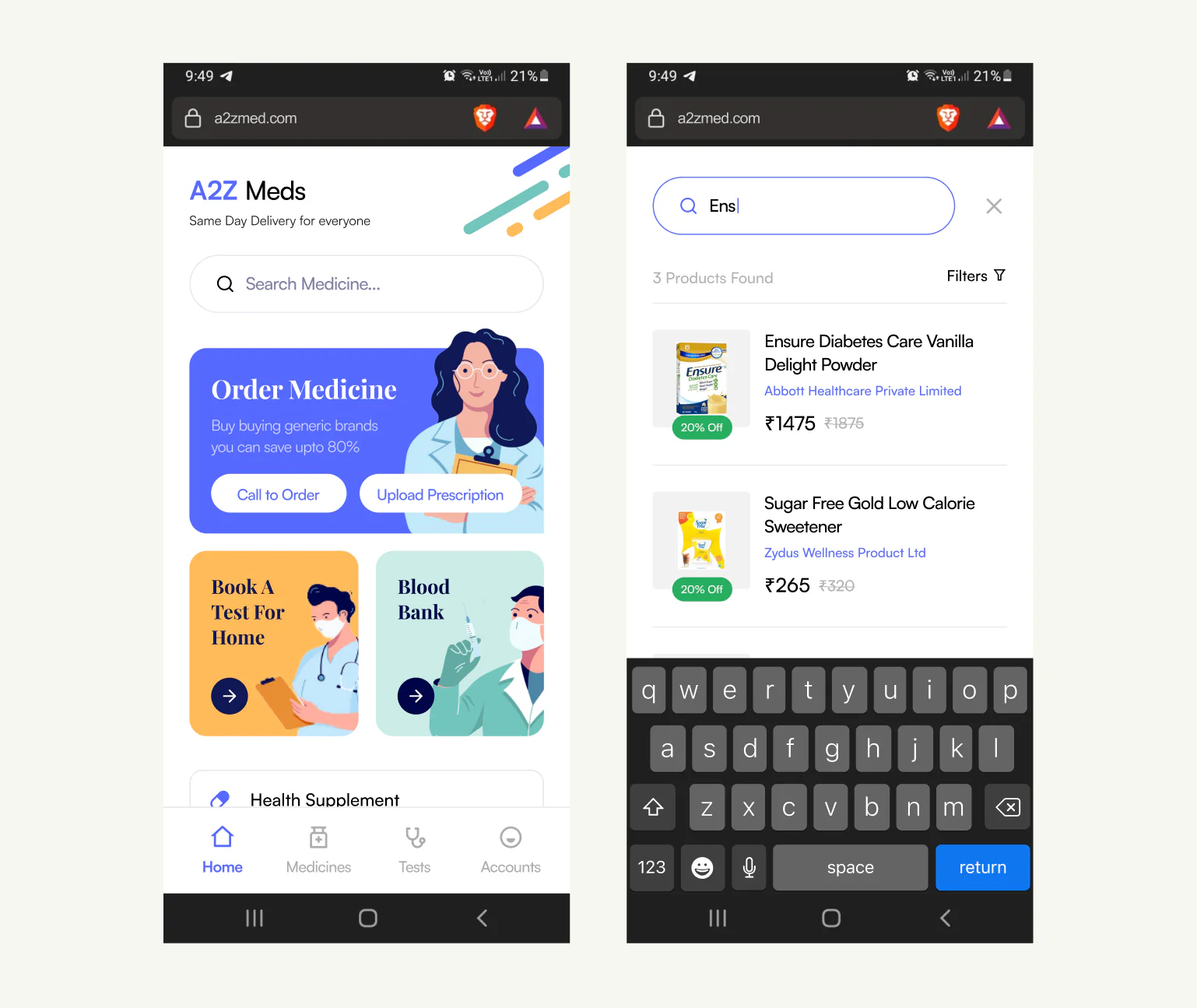
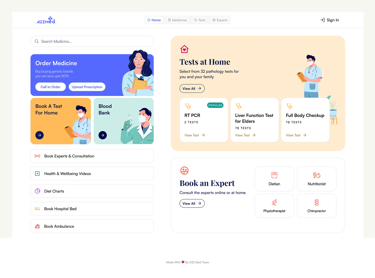
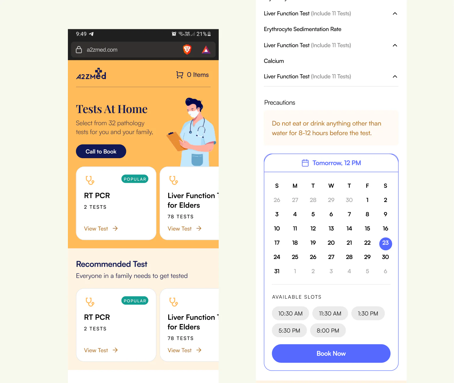
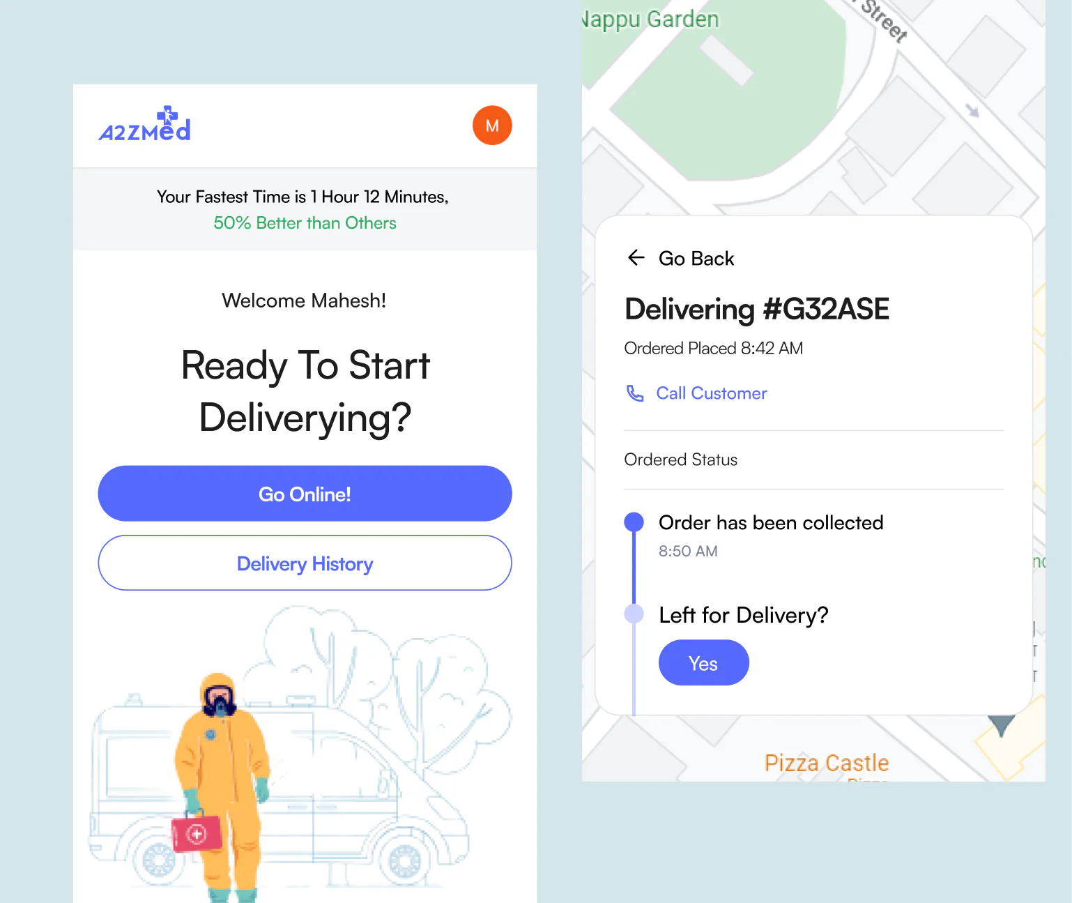
Here are a few flows to try out:
Current Situation
Sadly the company has shut down and moved on to pursue their offline operations. There is no online presence anymore.